let’s get groovy
A conceptual music festival campaign creating a bold, energetic visual identity across posters, advertising, and event materials.
role | Graphic Designer
deliverables | Brand Identity • Campaign Design • Advertising • Event Collateral
overview
Let’s Get Groovy is a conceptual music festival campaign designed to capture the energy and spontaneity of live music. I developed a cohesive visual identity using vibrant color, expressive typography, playful illustration, and fluid graphic forms, extending the system across print, digital, and environmental applications.
challenge
The challenge was to create a festival identity that felt energetic and youthful while remaining cohesive across a wide range of applications. The system needed enough flexibility to give each touchpoint its own personality while maintaining a recognizable visual language across print, digital, and environmental formats.
creative direction
The visual direction focused on capturing the energy and spontaneity of live music through bold color, playful typography, expressive illustration, and fluid graphic forms. These references helped shape a youthful identity that feels lively, approachable, and full of movement.
inspiration board
live music photography captures the energy and atmosphere of the festival
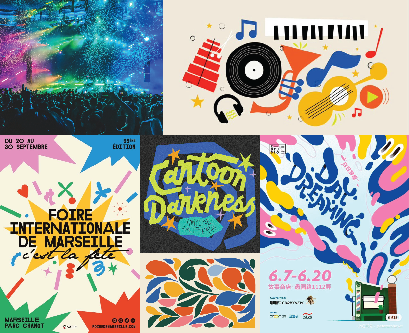

playful illustration creates
a youthful, expressive
visual language
bold color, expressive typography, and organic forms create movement
and energy

brand identity
The brand identity brings the festival’s energetic personality to life through expressive typography, bold color, playful illustration, and fluid graphic forms. Together, these elements create a flexible visual system that feels youthful, lively, and distinctly tied to the experience of live music.
wordmark
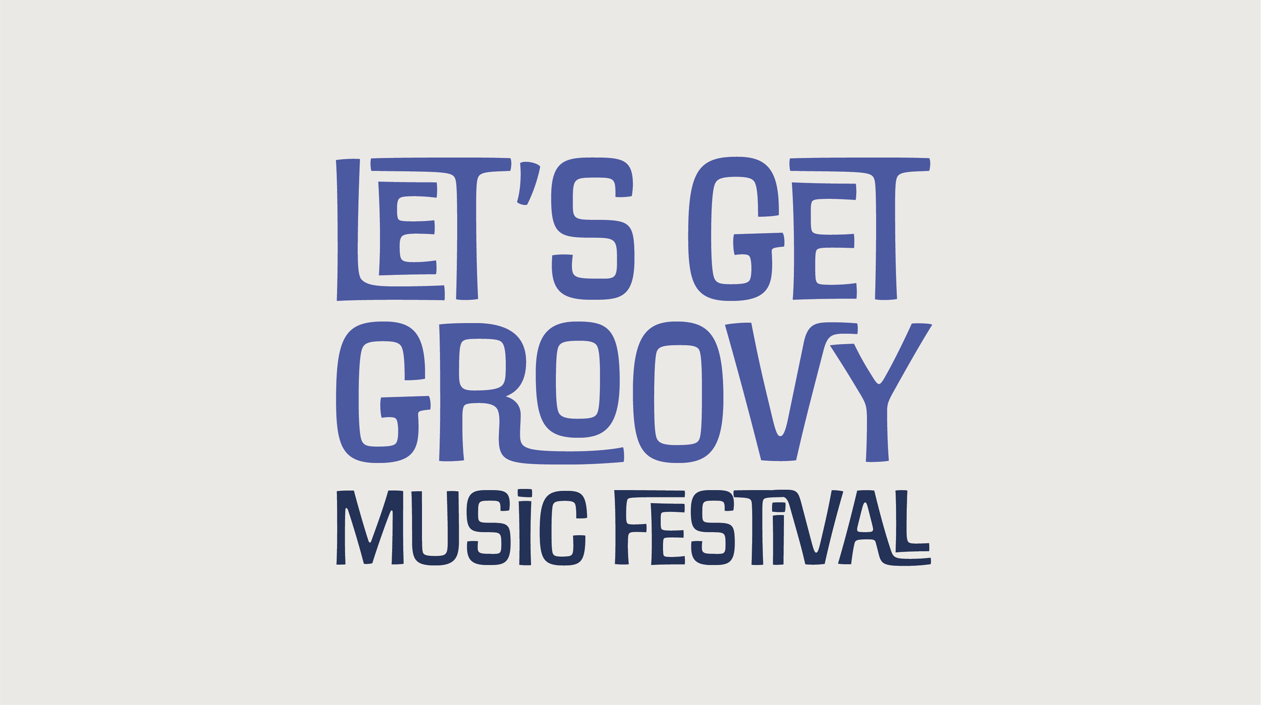
The wordmark uses bold, expressive typography to establish the playful personality of the festival. Its fluid letterforms and varied scale create a sense of movement and energy, reflecting the lively atmosphere of the overall campaign.
A vibrant palette of pink, orange, green, blue, and yellow brings energy and variety to the identity. The colors are used in different combinations across the campaign, allowing each application to feel distinct while maintaining a cohesive visual language.
color palette

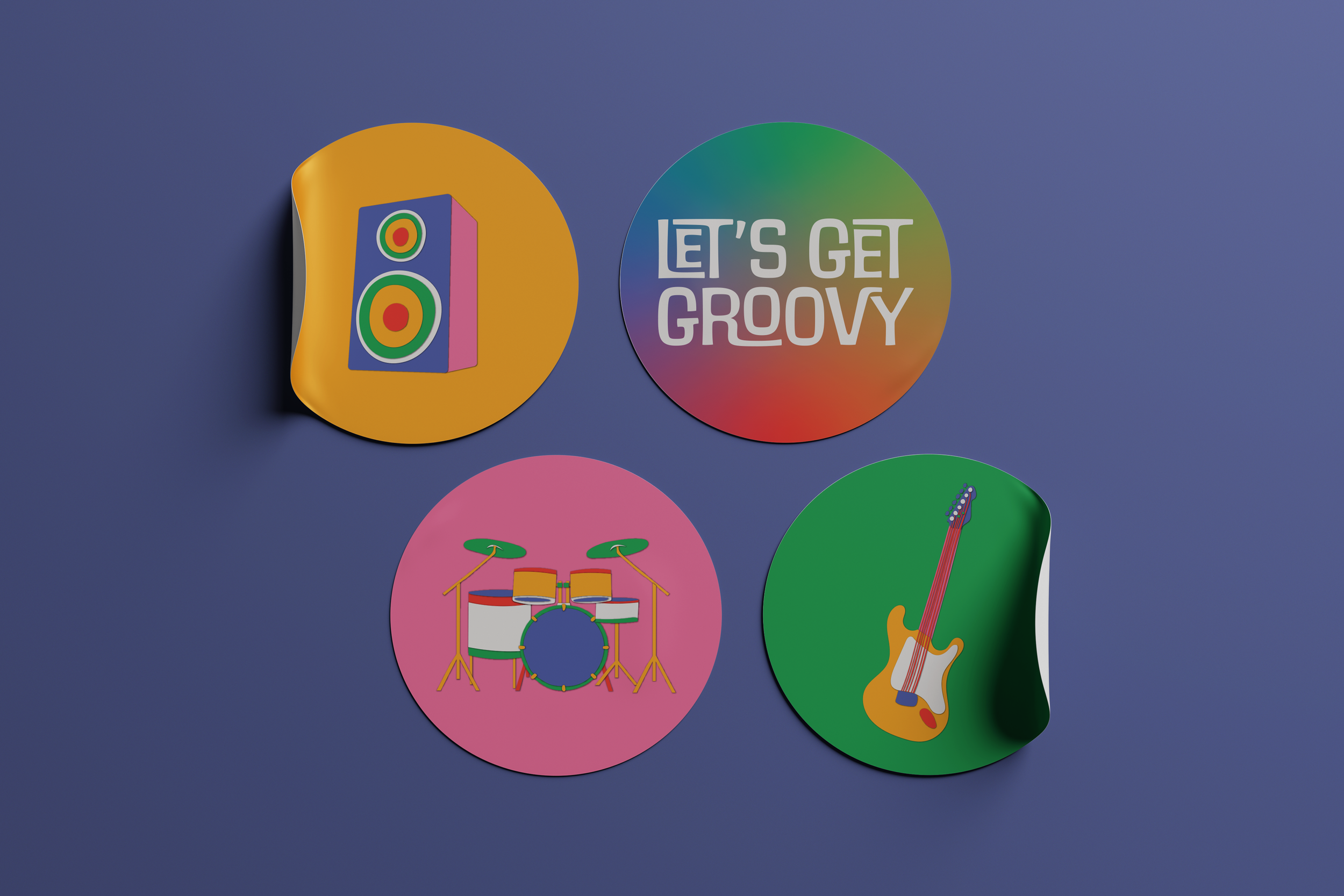
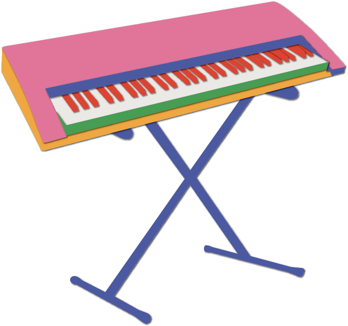
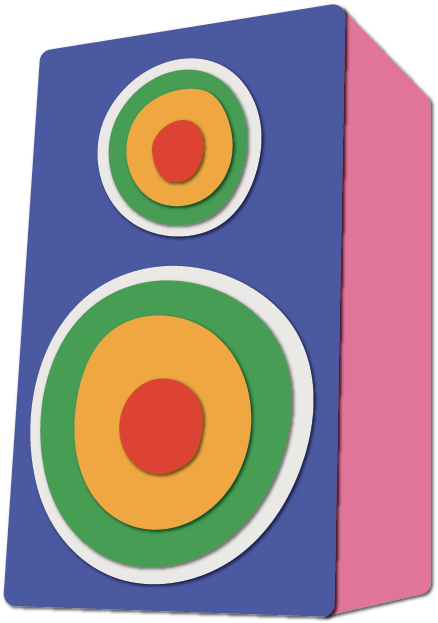
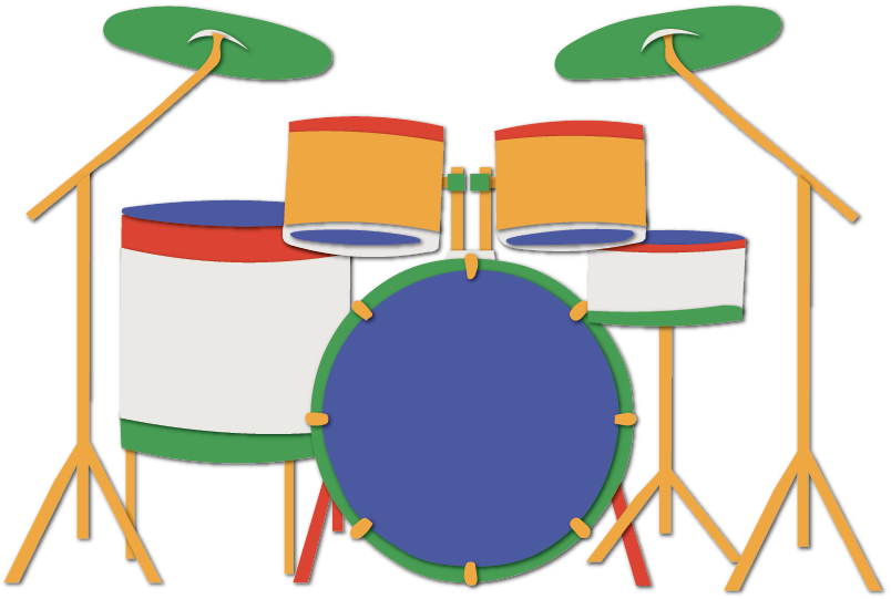
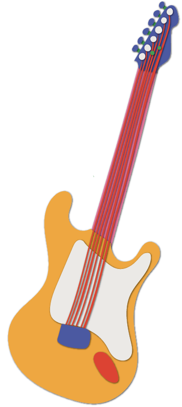
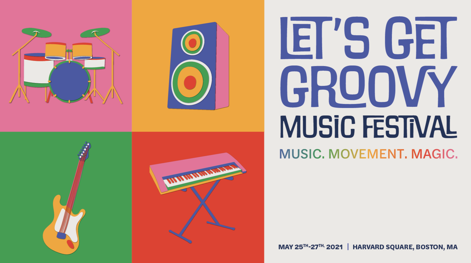
A series of stylized musical illustrations extends the identity across the campaign. Simple forms, bold color, and playful proportions create a consistent visual language while giving each application its own personality.
illustration system
campaign
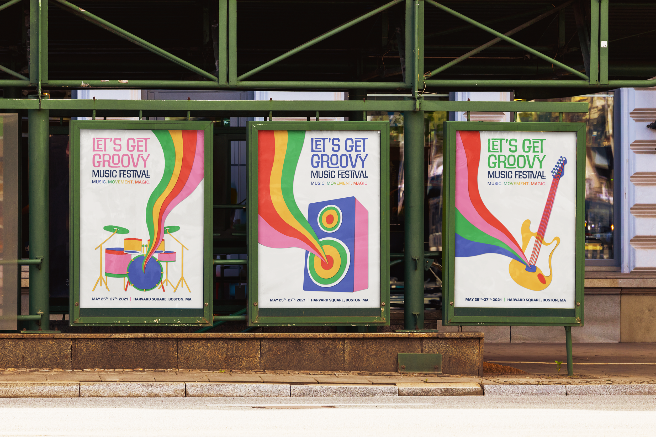
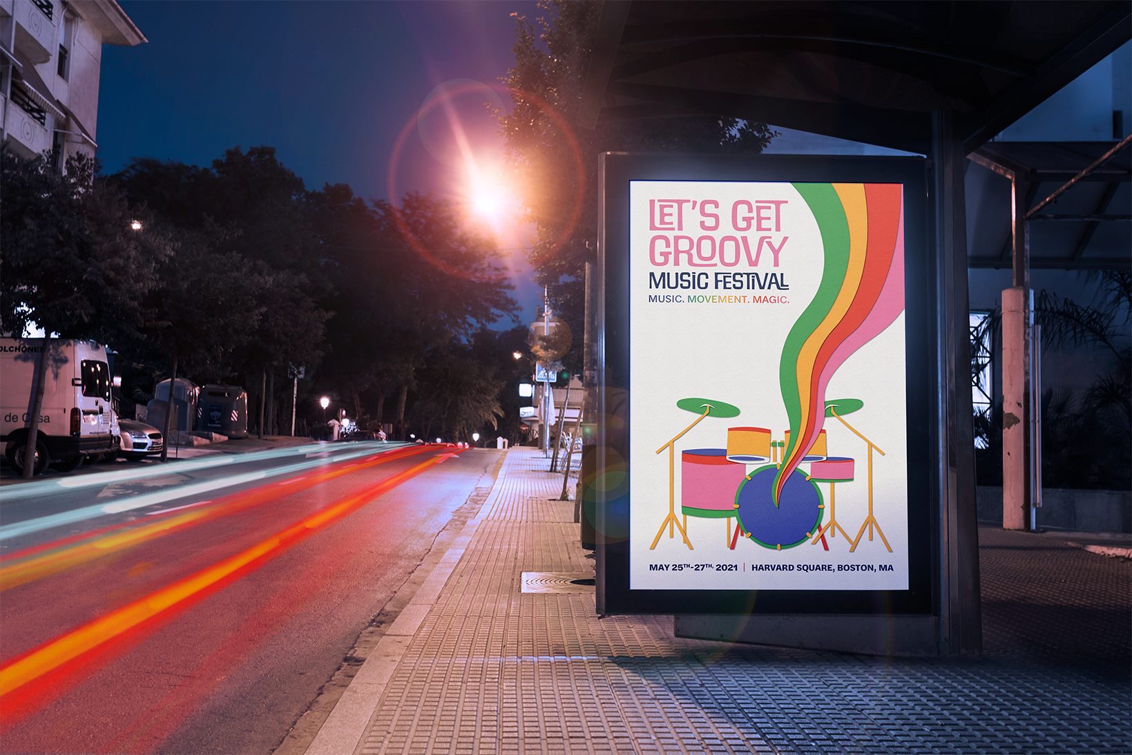
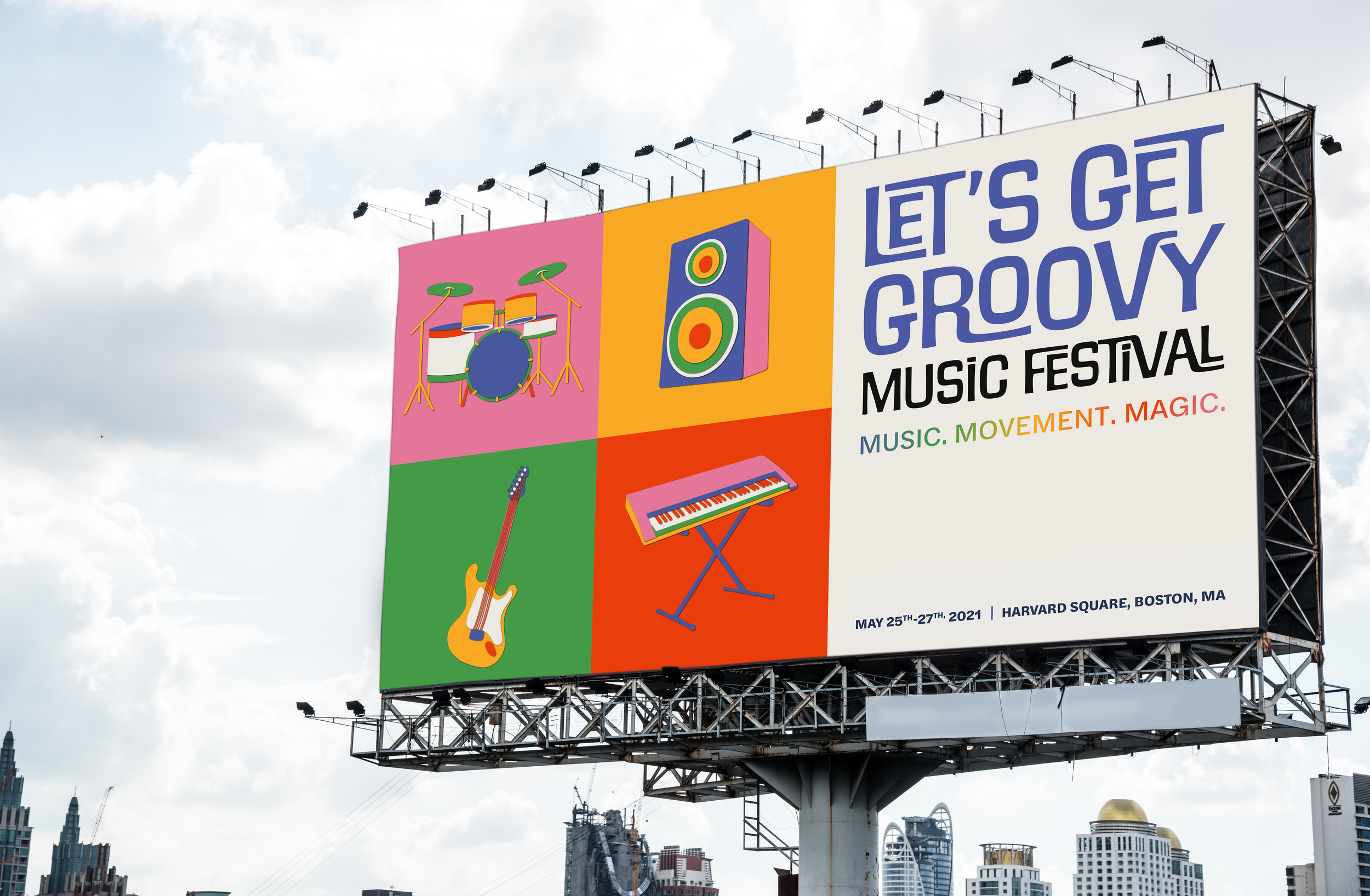
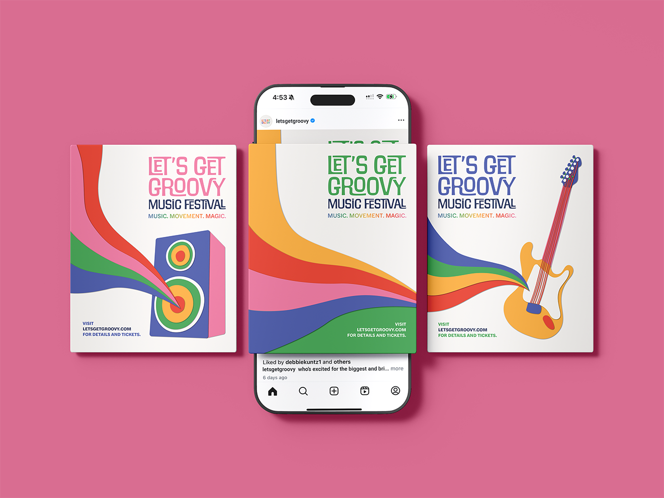
The identity comes together across a series of campaign materials designed to build excitement for the festival. The system allows color, illustration, and graphic elements to shift across applications while maintaining a consistent and recognizable look.
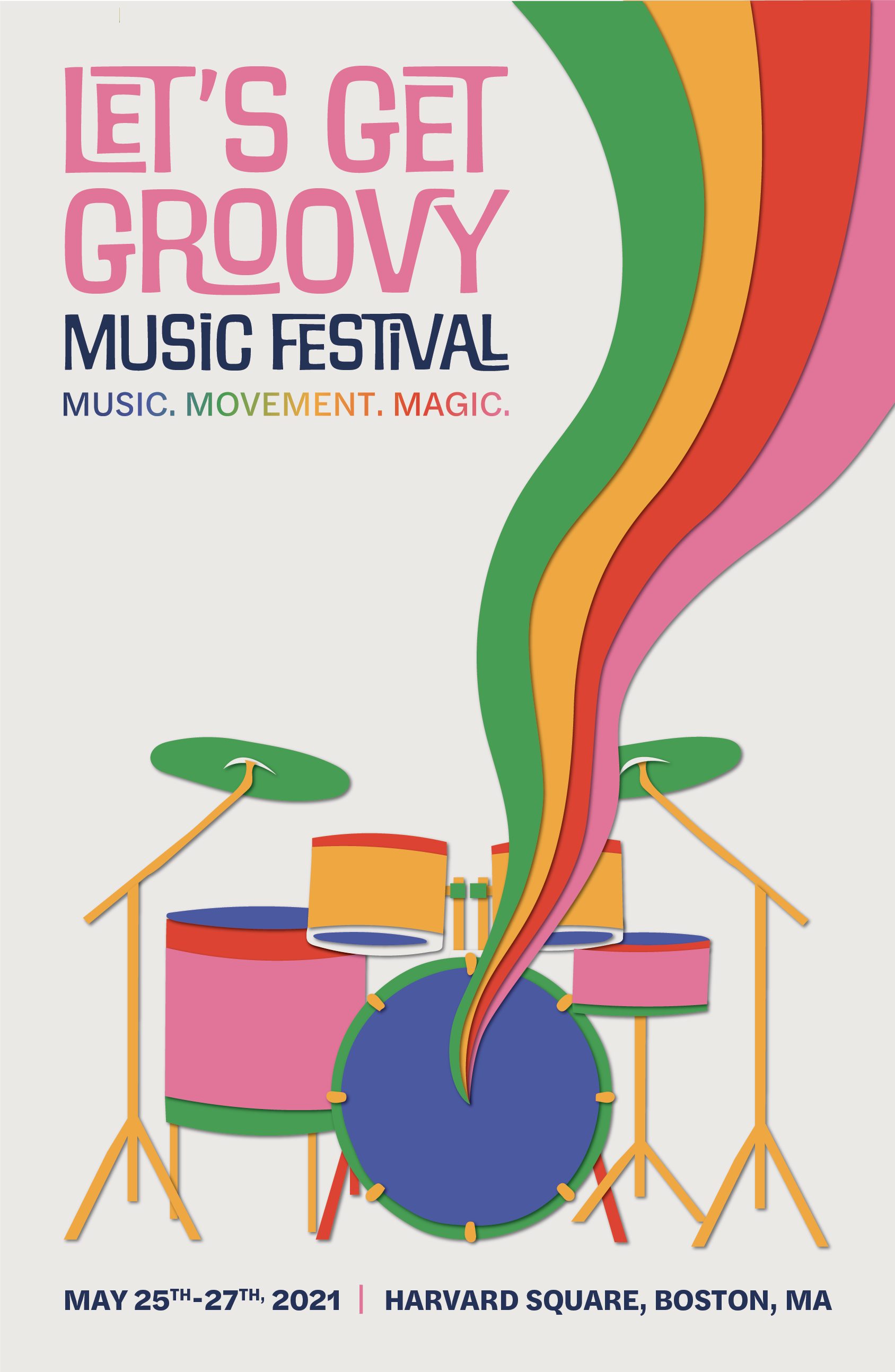
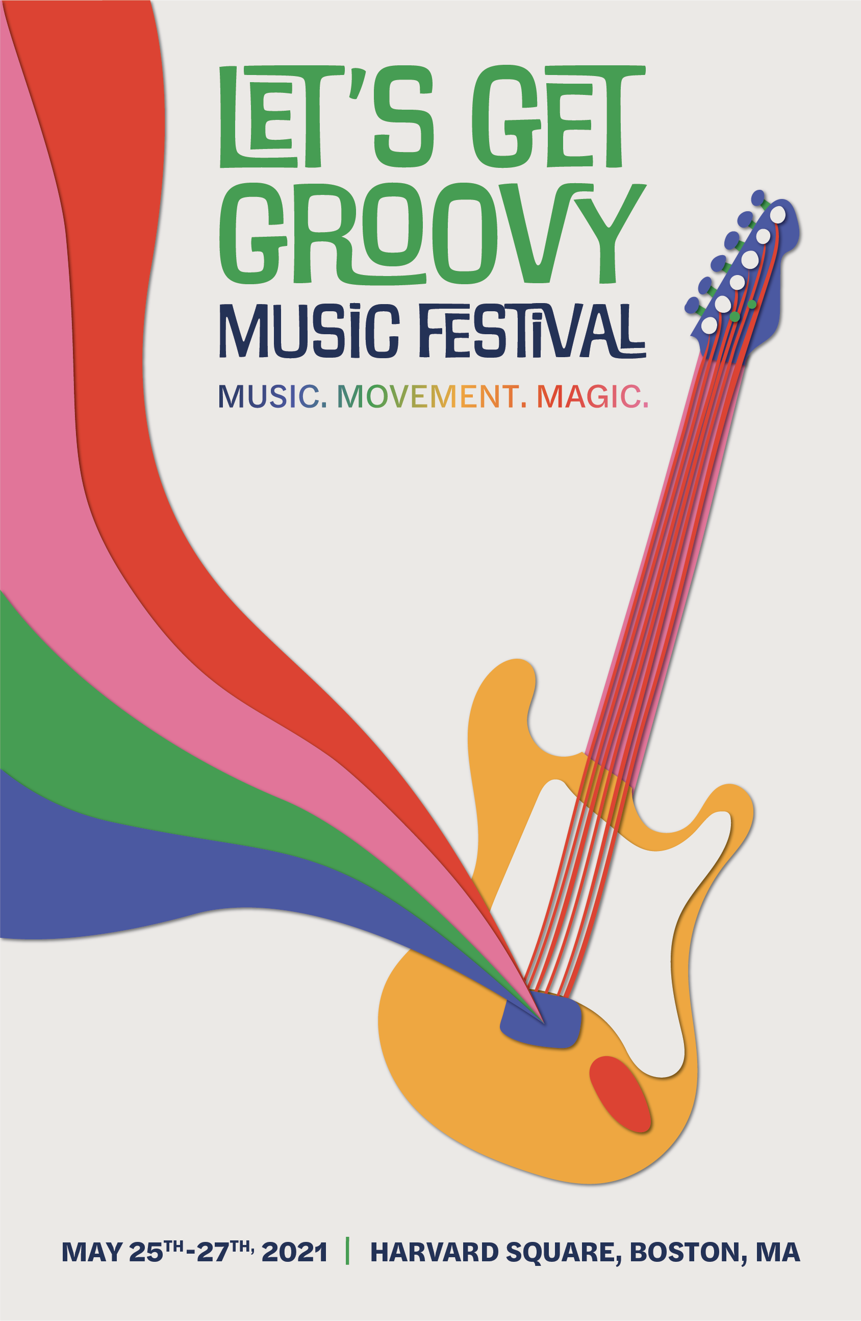
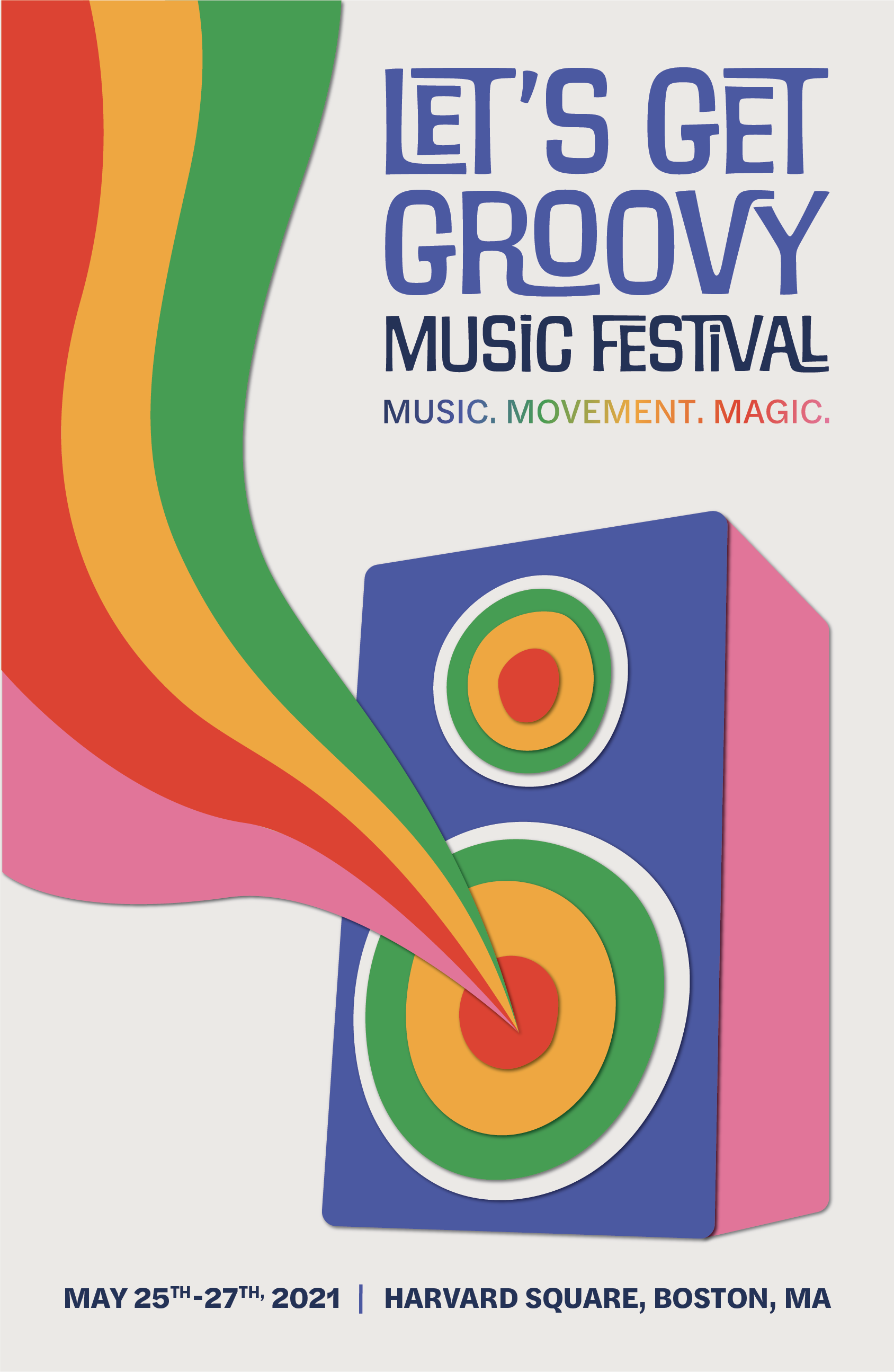
poster series
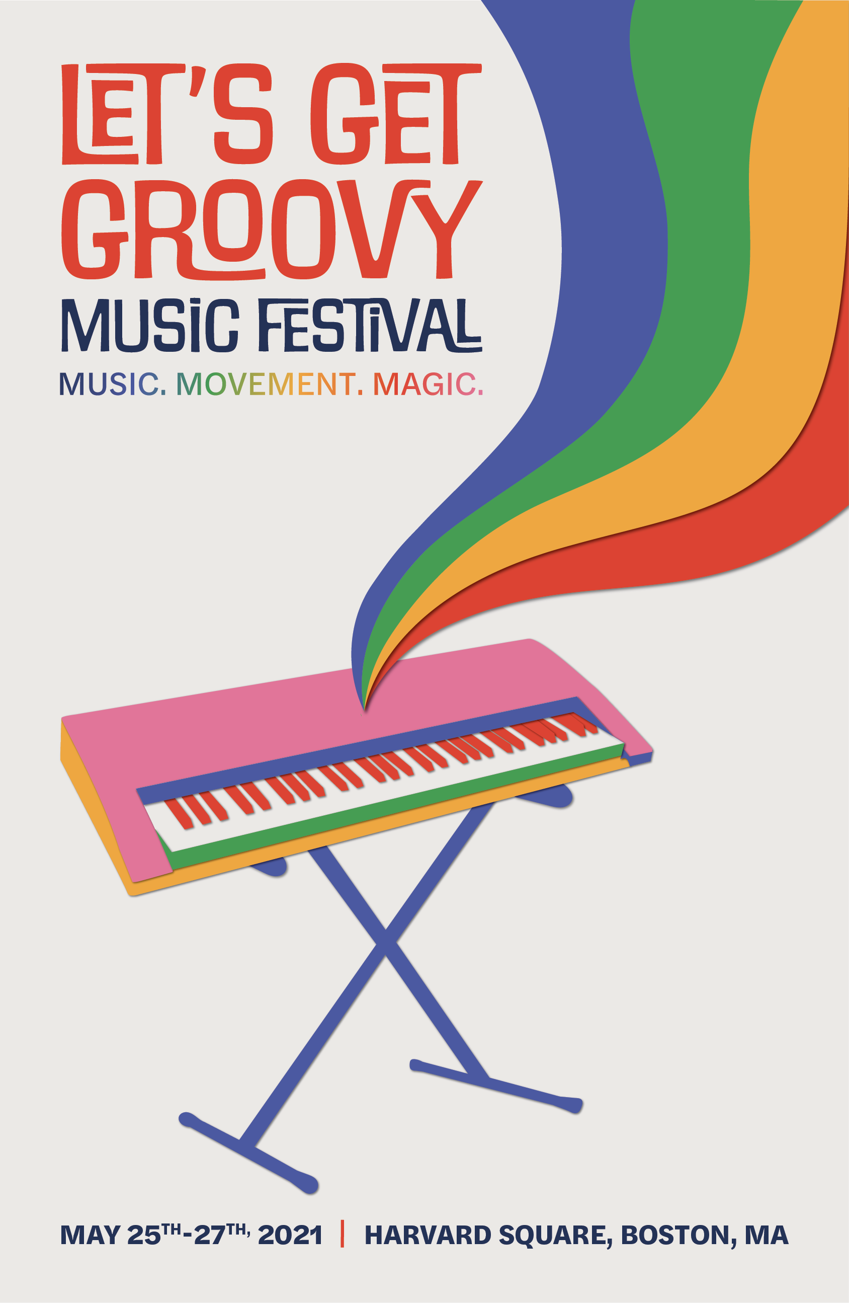
billboard
social media

tickets