the everywhere project
A visual identity and social campaign designed to build awareness and create a cohesive digital presence for a nonprofit organization.
role | Graphic Designer
timeline | 4 Months
deliverables | Brand Identity • Logo Design • Iconography • Social Media
overview
The Everywhere Project is a nonprofit organization focused on expanding access to harm reduction resources and community education. I redesigned the organization's visual identity to create a cohesive brand system that improved recognition, strengthened communication, and supported consistent messaging across both print and digital platforms.
challenge
The existing identity lacked consistency across educational materials, digital communications, and promotional assets, making it difficult to build recognition and present information in a clear, approachable way. The challenge was creating a flexible visual system that felt welcoming and trustworthy while supporting a wide range of community outreach materials.
brand system
I developed a scalable brand system built around a refined logo, custom iconography, approachable typography, and a vibrant color palette. Each element was designed to work together across educational resources, marketing materials, and digital platforms while maintaining consistency and accessibility.
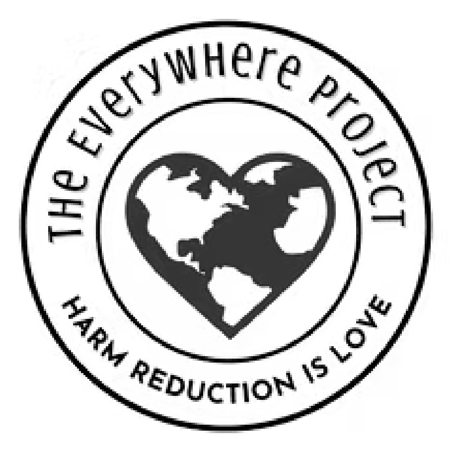
The redesigned logo combines a heart and the letter "e" into a simple, memorable mark that reflects compassion, connection, and The Everywhere Project's mission of meeting people where they are.
logo evolution


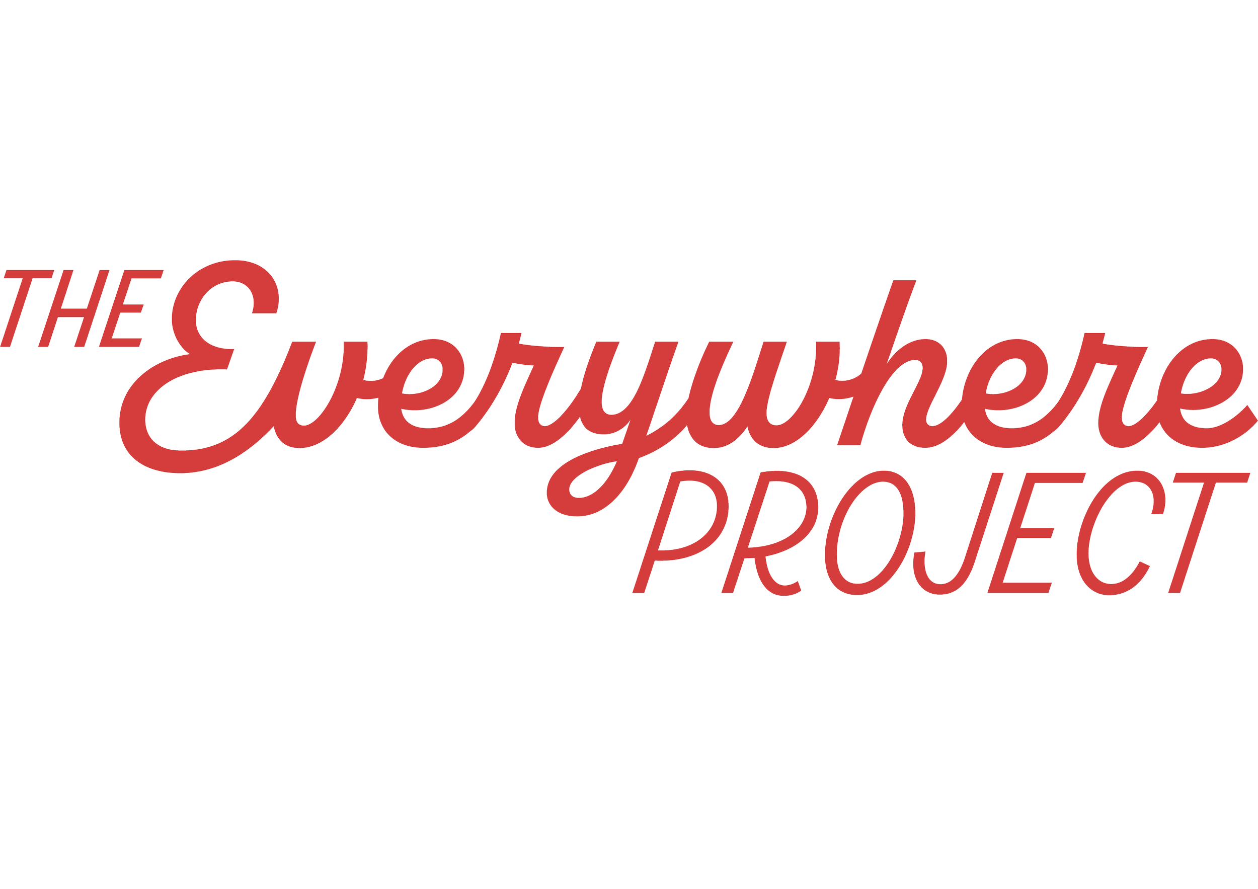
The Everywhere Project wordmark blends warmth, personality, and function. I chose a mid-century-inspired typeface with rounded forms to create a tone that feels friendly, reliable, and human. The subtle forward tilt adds a sense of motion and optimism, reinforcing the notion of progress.
wordmark
color palette
The color palette balances warmth and optimism with clarity and accessibility. Vibrant accent colors create an approachable, community-focused identity while neutral tones provide flexibility across educational materials and digital communications.
The icon system was designed to be clean, legible, and flexible across a wide range of applications. Each icon represents a core area of support—connection, education, clothing, medical care, and harm reduction—making it easy to communicate services at a glance.
iconography


social media
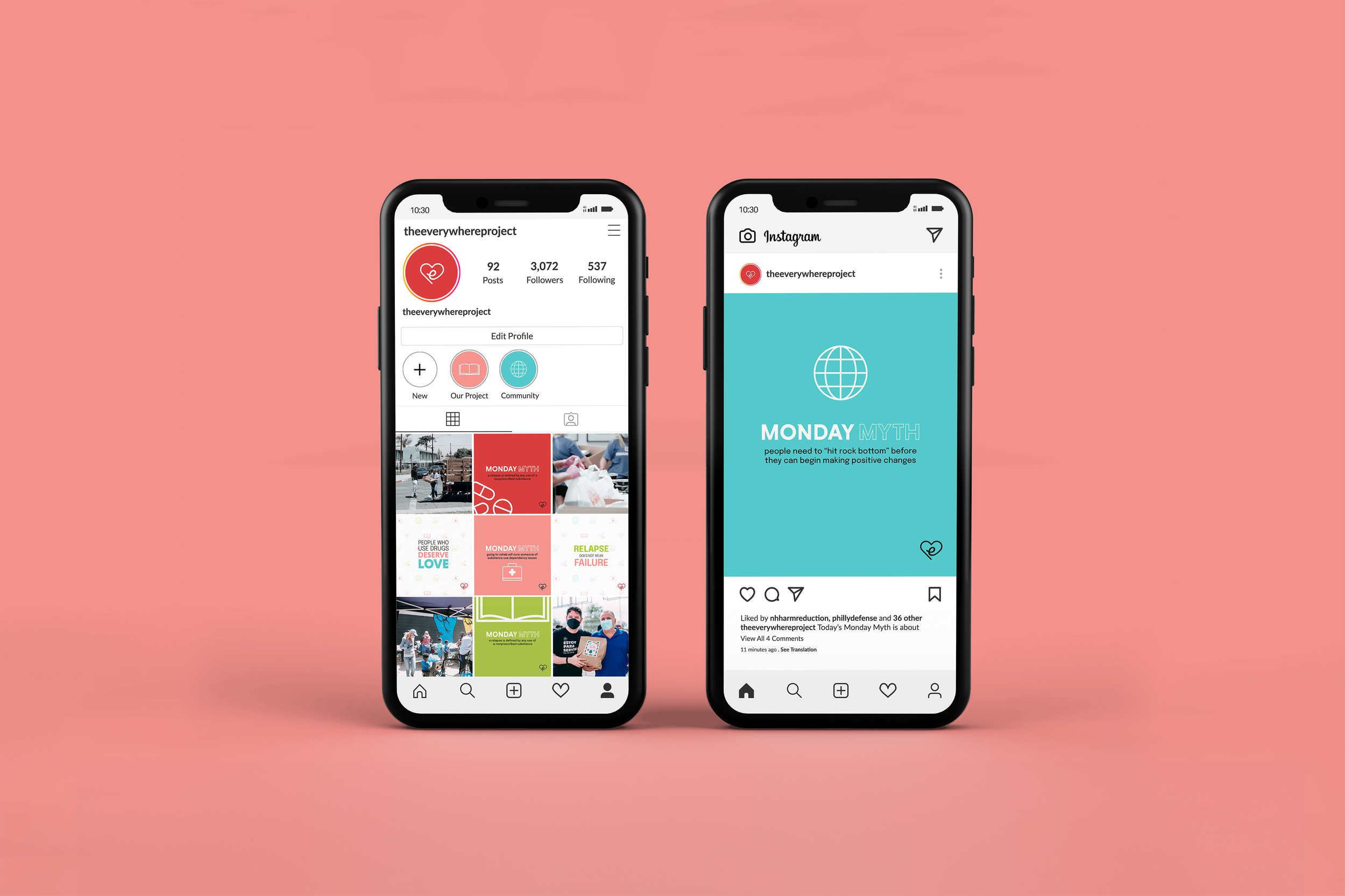
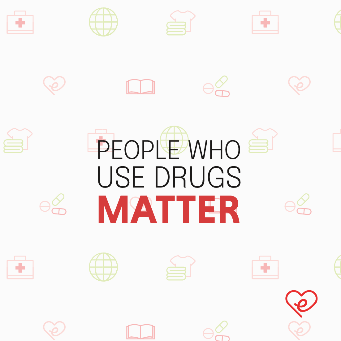
The redesigned social media system modernizes the organization's digital presence while creating a cohesive visual language across educational content. Consistent typography, color, iconography, and photography work together to improve recognition and communicate information clearly.
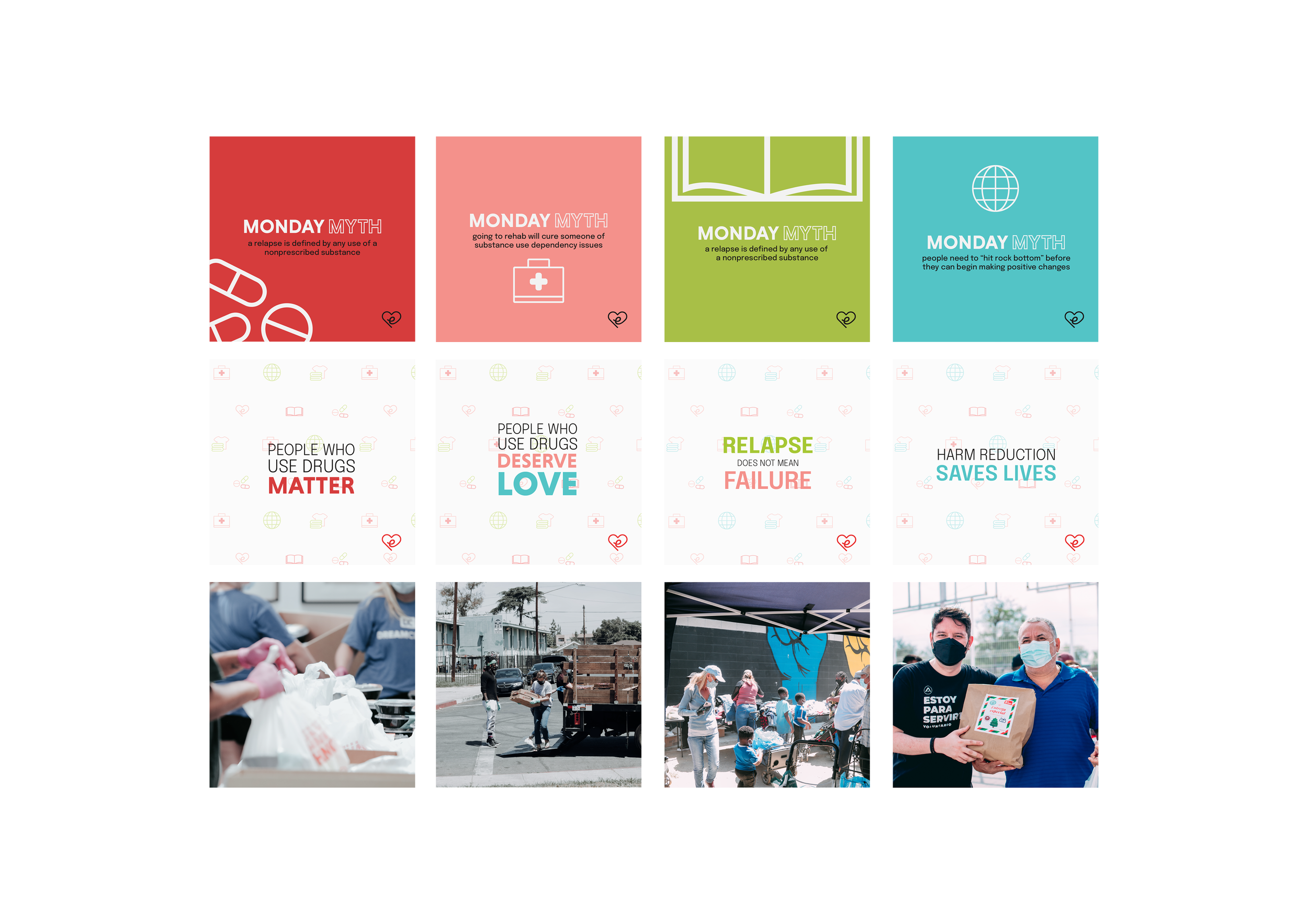
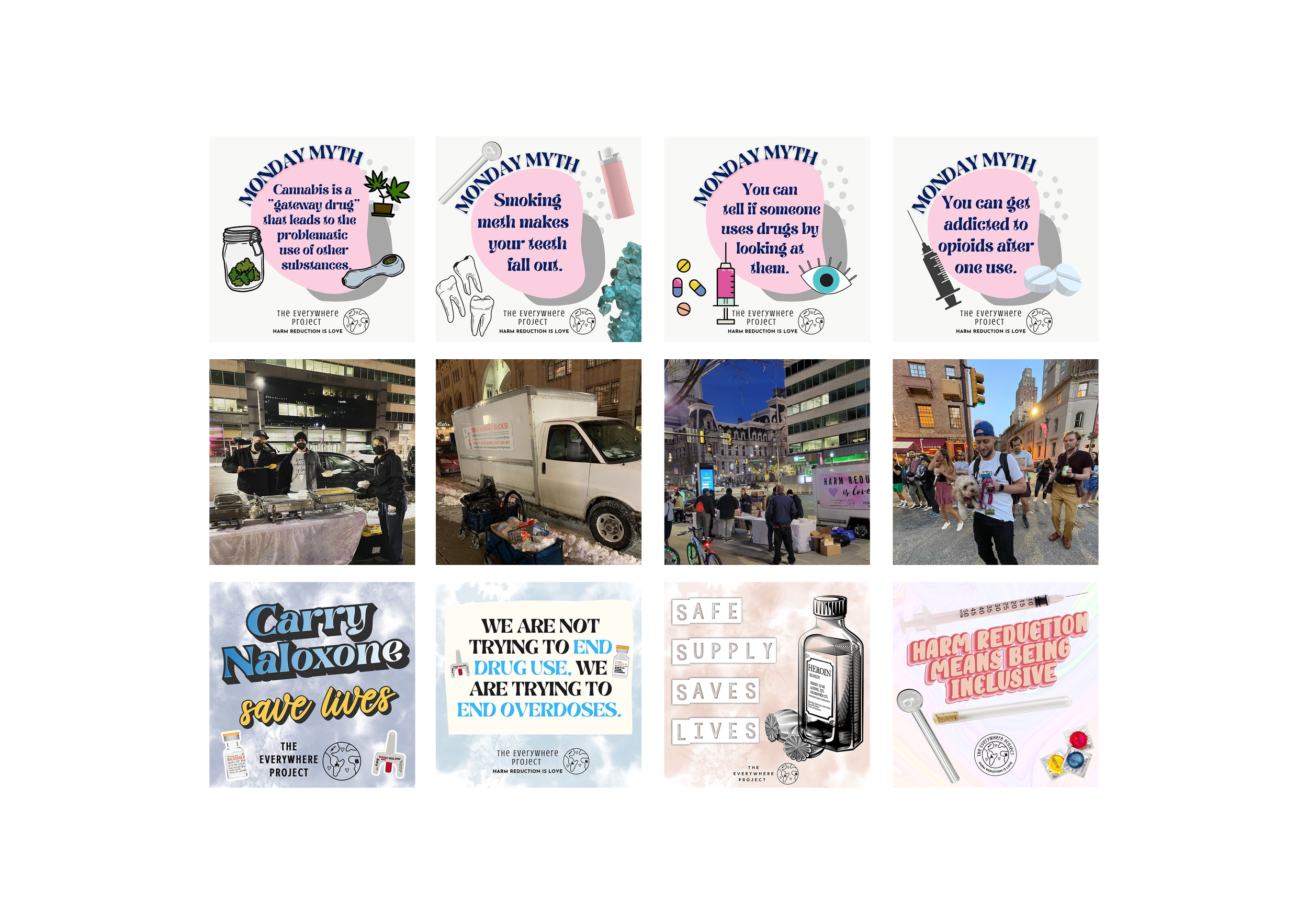
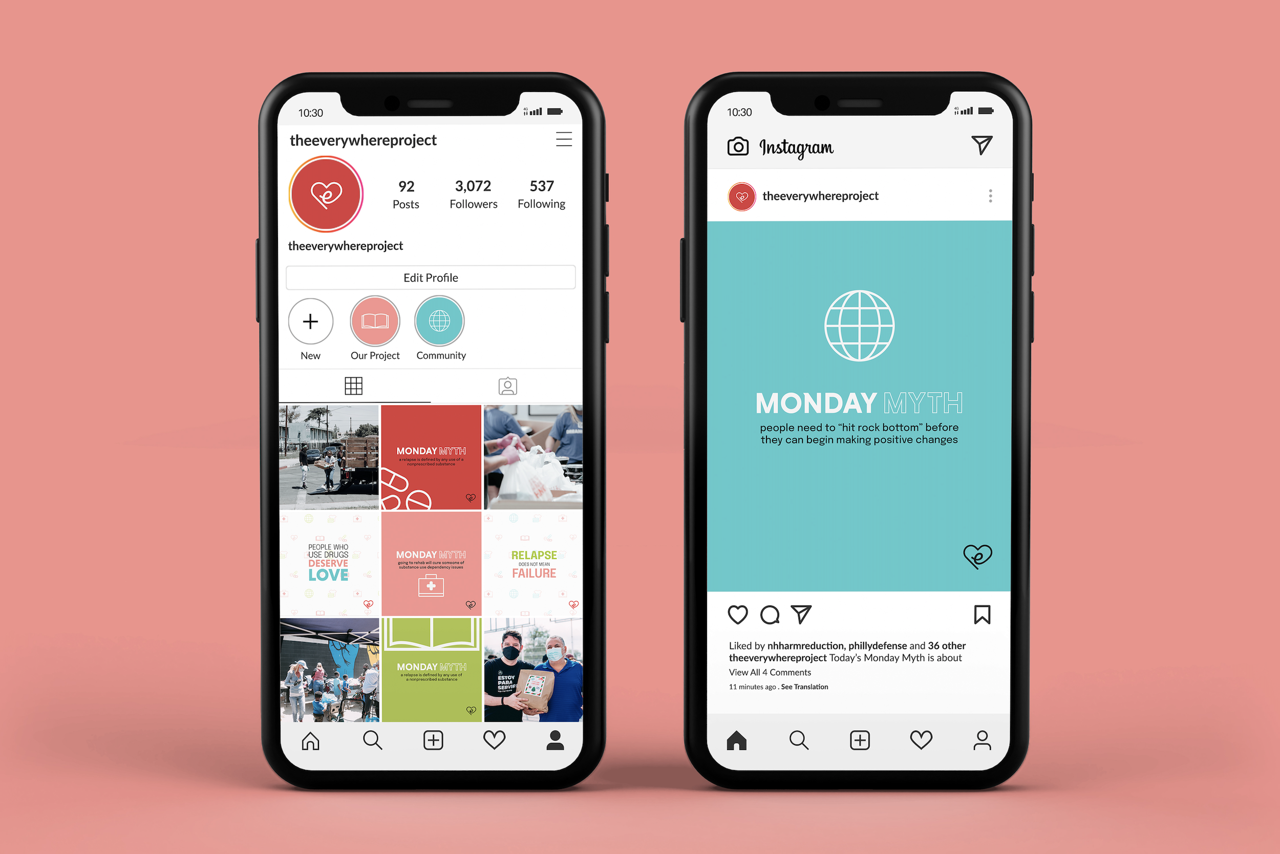

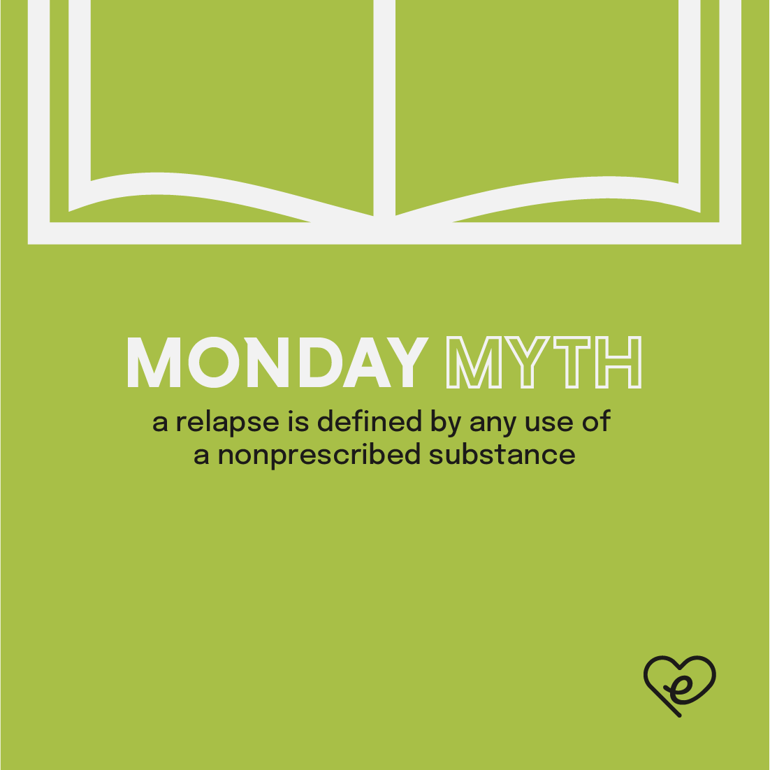
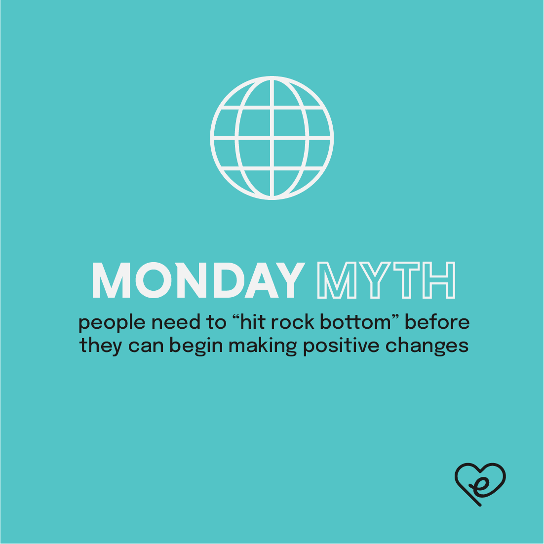

The new system also incorporates pattern backgrounds with faint, repeated icons for visual texture.

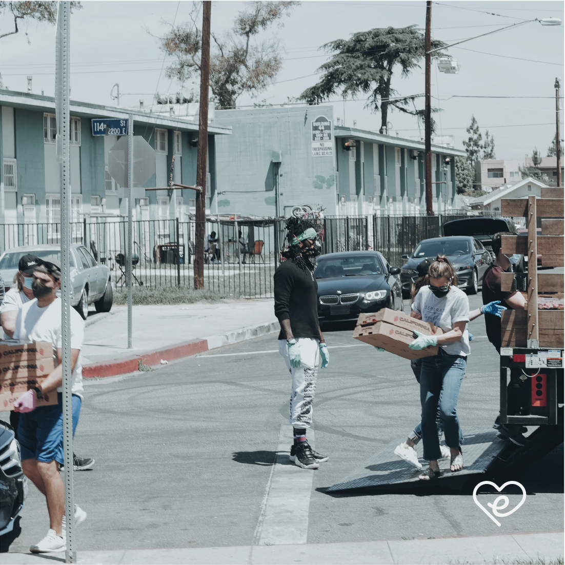
Photography is integrated in a structured way, balancing community-focused imagery with bold, educational graphics.