


the everywhere project brand system
Develop a cohesive brand identity system to unify The Everywhere Project’s communication across print and digital platforms. The goal was to elevate the organization’s presence and improve clarity and accessibility in delivering life-saving harm reduction resources.
overview
role
Designer
design focus
Visual identity, branding, custom iconography, social media design

This moodboard set the tone for the brand by pulling from warm, community-driven imagery and approachable, modern design. I looked at textures, color blocking, and type that felt clear and human, while still professional.
These influences guided the visual system toward something compassionate, grounded, and easy to use.
inspiration
approach
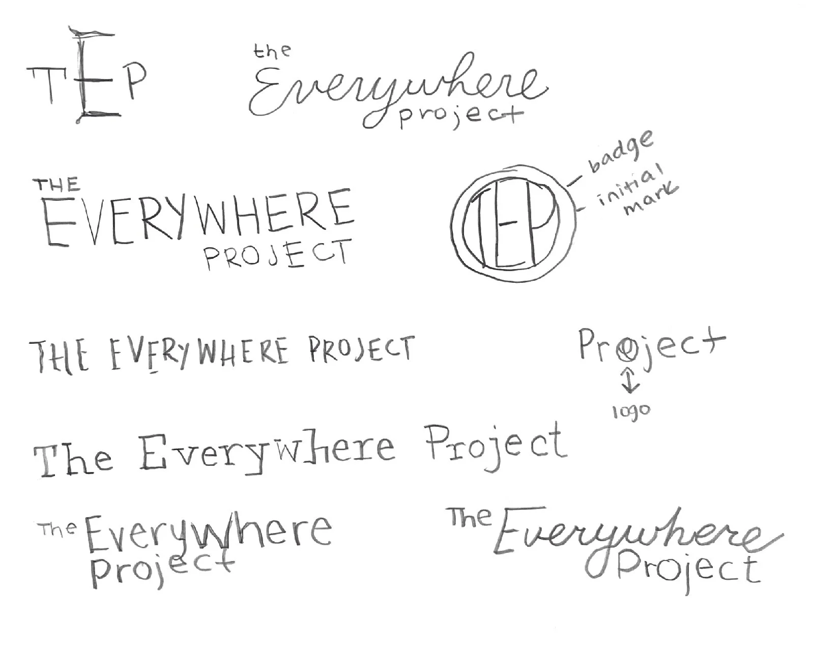
I started with quick layout sketches to map out hierarchy, test logo and wordmark options, and plan where icons and infographics could add clarity. These drawings helped me think through consistency and created a roadmap for the final brand system.
sketches


I explored a wide range of type treatments to find the right voice for The Everywhere Project. I was looking for something that felt approachable and human while still being clear, trustworthy, and easy to read in both print and digital formats.
wordmark exploration


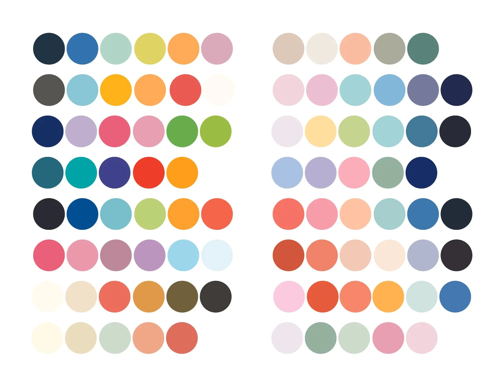
I tested combinations across soft pastels, saturated brights, and deeper tones to see what could best support the goals of the brand and find a system that felt energetic, human, and grounded.
color exploration
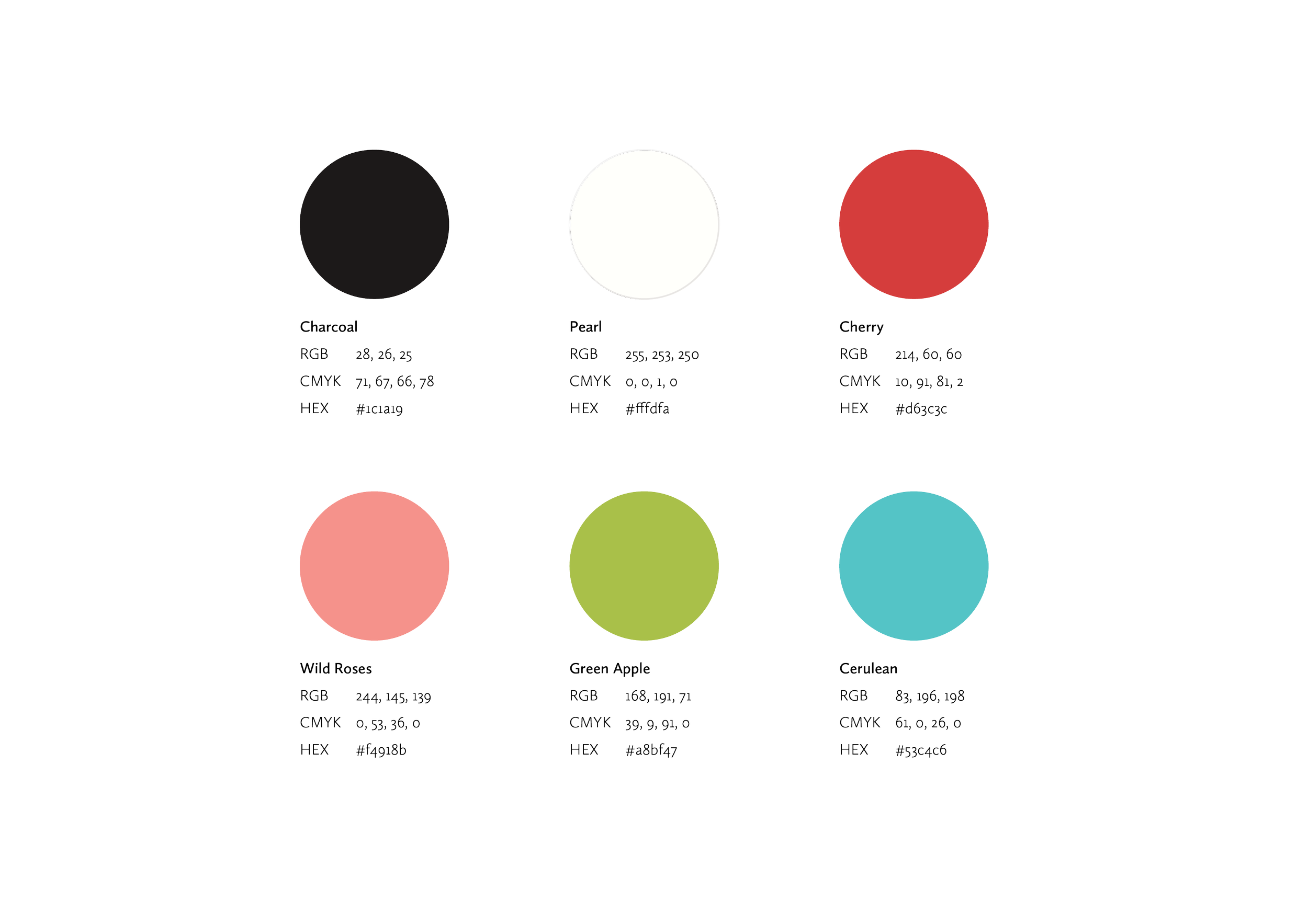
The color palette is designed to reflect the organization’s warmth, inclusivity, and commitment to positive change. Together, this palette communicates the core values of urgency, advocacy, growth, renewal, and hope.
brand color palette
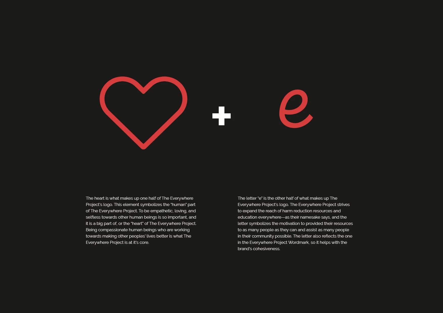
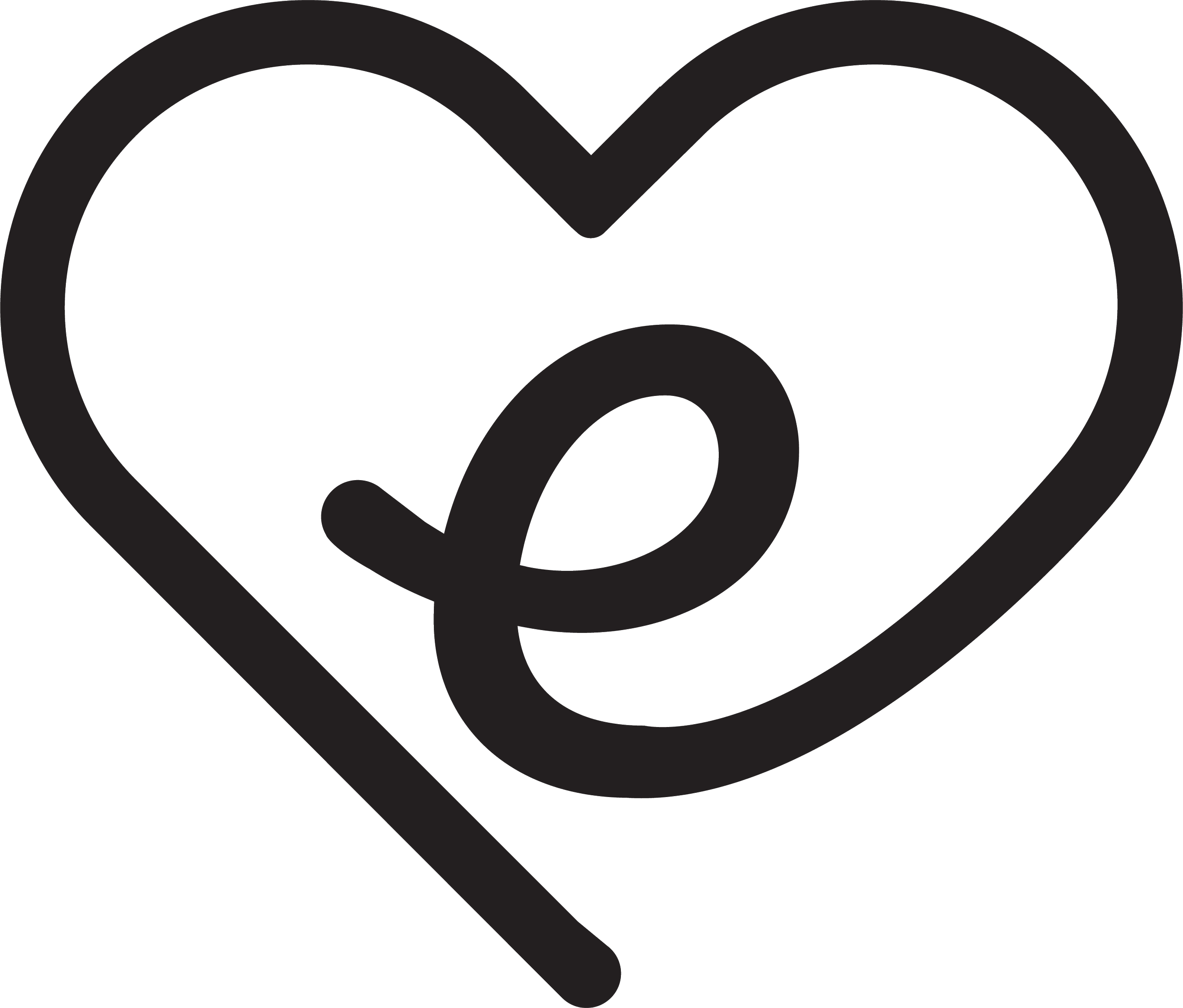
The Everywhere Project’s logomark brings together two simple but meaningful symbols: a heart and the letter “e.”
logomark
before rebrand
after rebrand
The Everywhere Project wordmark blends warmth, personality, and function. I chose a mid-century-inspired typeface with rounded forms to create a tone that feels friendly, reliable, and human. The subtle forward tilt adds a sense of motion and optimism, reinforcing the idea of progress.
wordmark

The icon system was designed to be clean, legible, and flexible across a wide range of applications. Each icon represents a core area of support—connection, education, clothing, medical care, and harm reduction—making it easy to communicate services at a glance. I used simple, monoline forms to keep the icons friendly and approachable, while color adds clarity and energy.
iconography

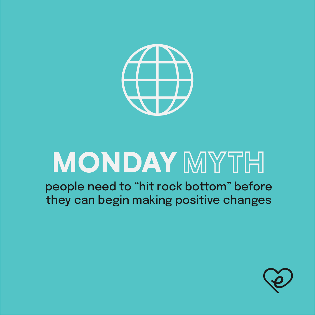
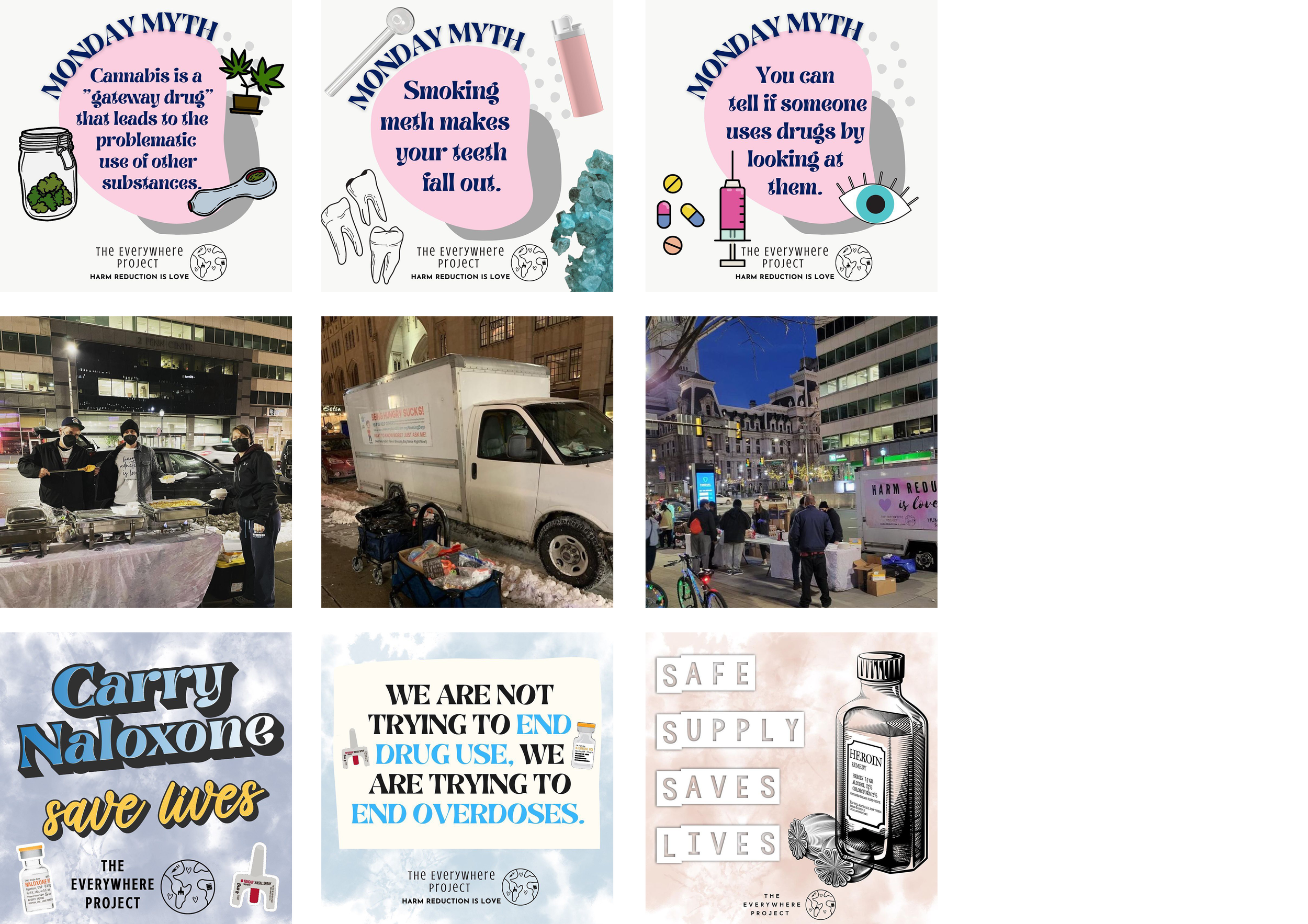
The redesigned social media system modernizes the brand’s presence while creating a clear, cohesive visual language across all posts. The updated layout introduces a clean, grid-based structure with consistent typography, a defined color palette, and a simplified icon system.
social media
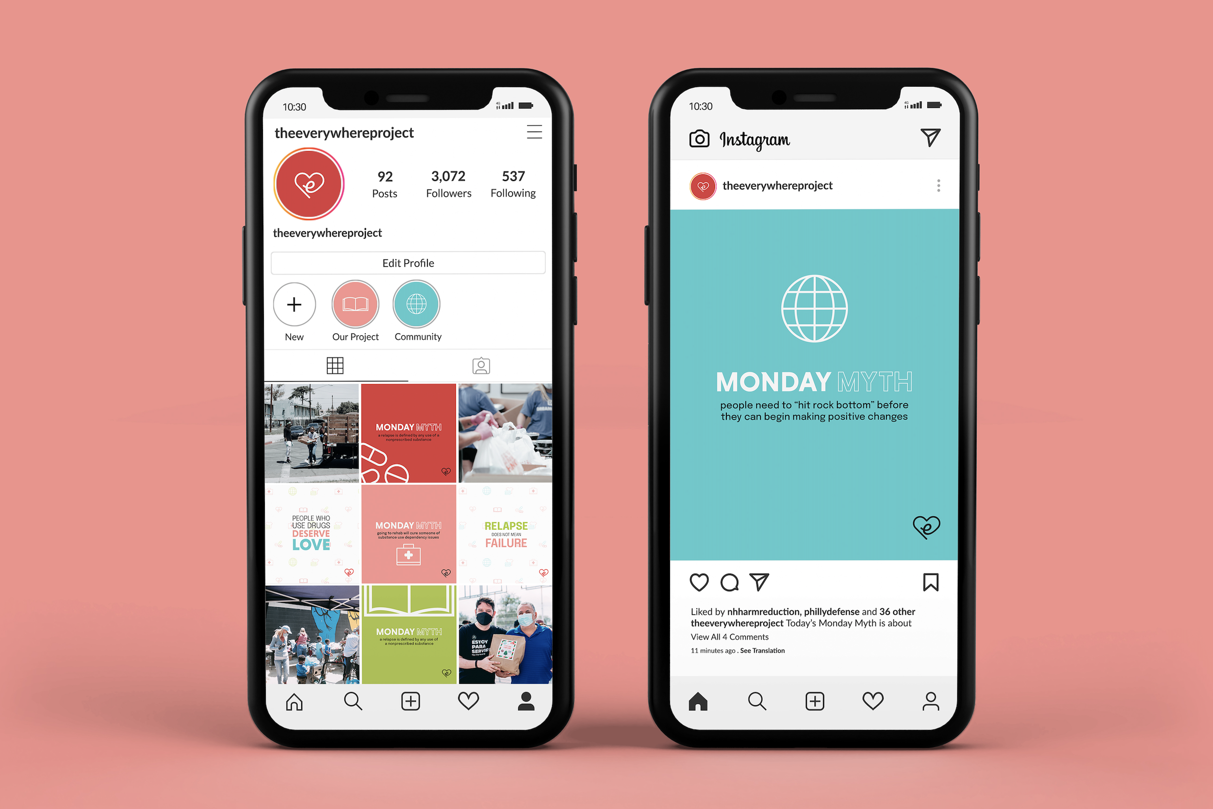

The new system also incorporates pattern backgrounds with faint, repeated icons for visual texture, replacing the heavier, more illustrative backgrounds of the original.
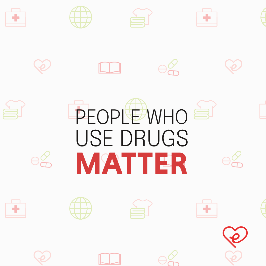

Photography is integrated in a structured way, balancing community-focused imagery with bold, educational graphics.


before rebrand

after rebrand
promotional materials

Design, graphics, and illustration by Catherine Kessler