

let’s get groovy ad campaign
The objective was to create an advertising campaign for a music festival called Let’s Get Groovy as part of an academic project. This 3-day event is all about live music and dancing, so the campaign needed to convey a bold, energetic, and fun vibe. The target audience skews younger, so I leaned into vibrant colors, playful illustrations, and eye-catching type to capture that sense of movement and excitement.
overview
role
Designer
design focus
Visual identity, campaigns, advertising, illustration, typography, social media, iconography

This moodboard shaped the visual direction for “Let’s Get Groovy” by pulling from music festival culture, bold poster art, and playful handcrafted design.
I drew inspiration from bright, high-contrast colors, paper cutout textures, and abstract patterns that suggest rhythm and energy.
inspiration
approach
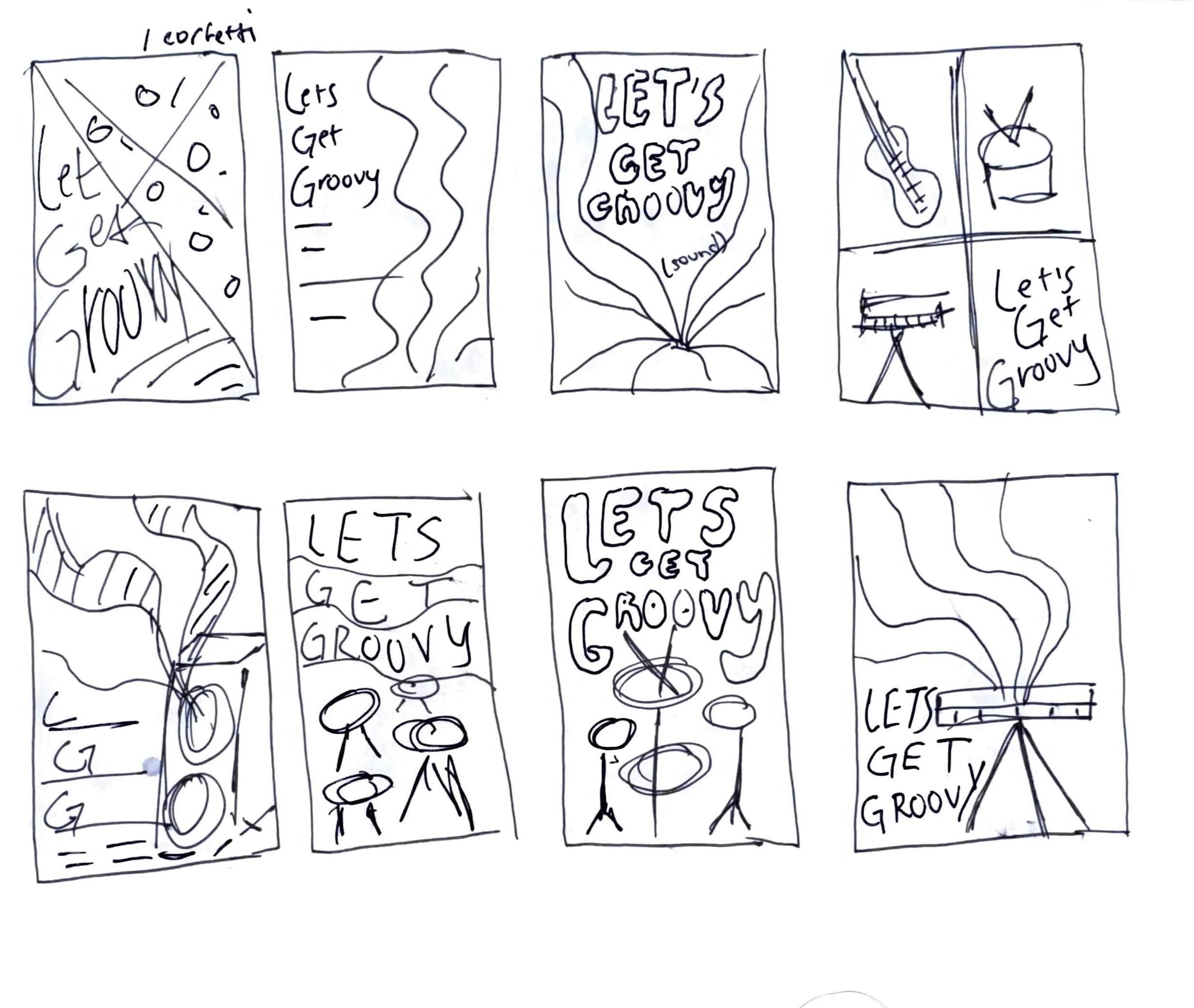
I started the project with a series of rough sketches to map out possible directions for the campaign posters. These quick drawings let me explore how instruments, typography, and rainbow swirls could interact to capture the festival’s playful energy. I tested different hierarchies, layouts, and scales to see how the illustrations might take center stage while still leaving room for the event details. While the sketches are loose, they were essential for shaping the final concept and set the groundwork for the bold, layered look that carried through the finished posters.
sketches

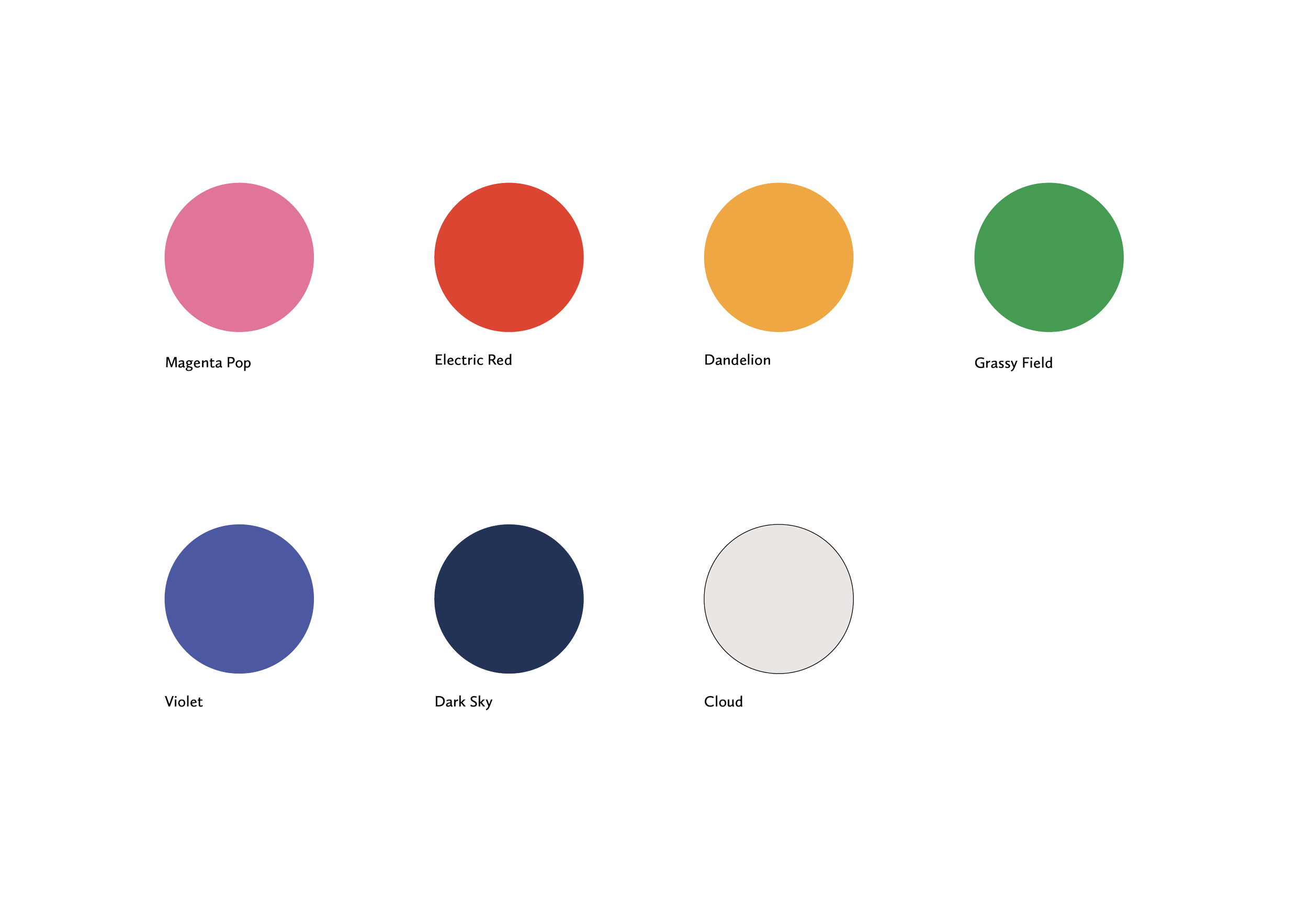
The color palette for Let’s Get Groovy was designed to capture the energy and playfulness of a summer music festival. Each hue carries a bold, vibrant quality that reflects the excitement of live music and the creative spirit of the event.
Together, these colors create a dynamic, high-contrast system that feels both whimsical and modern.
color selection

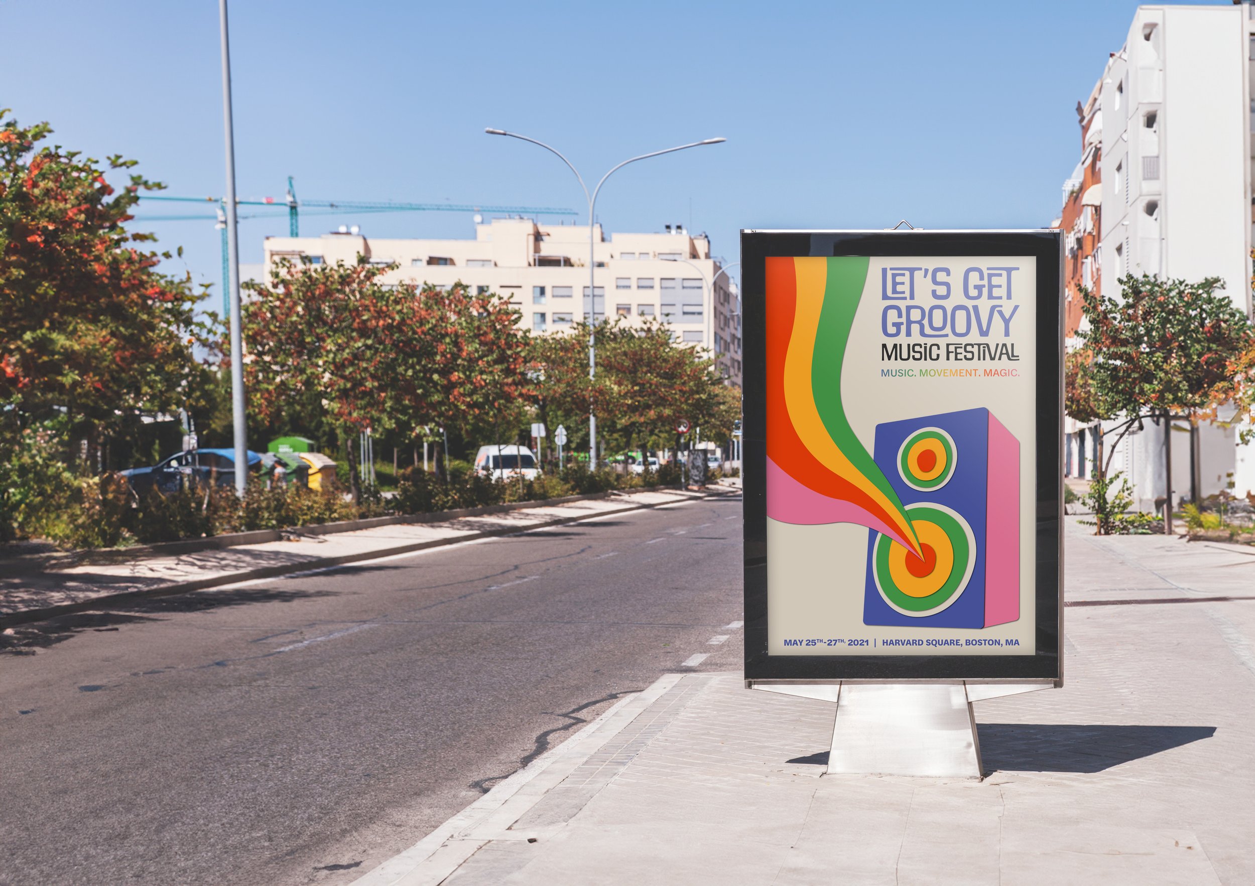
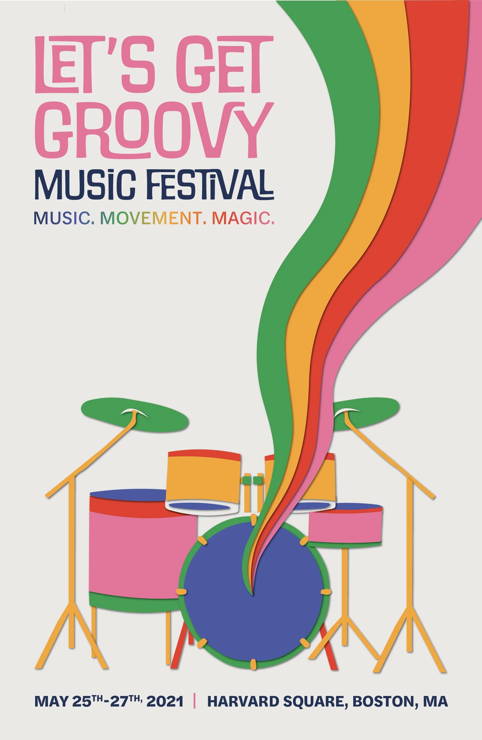
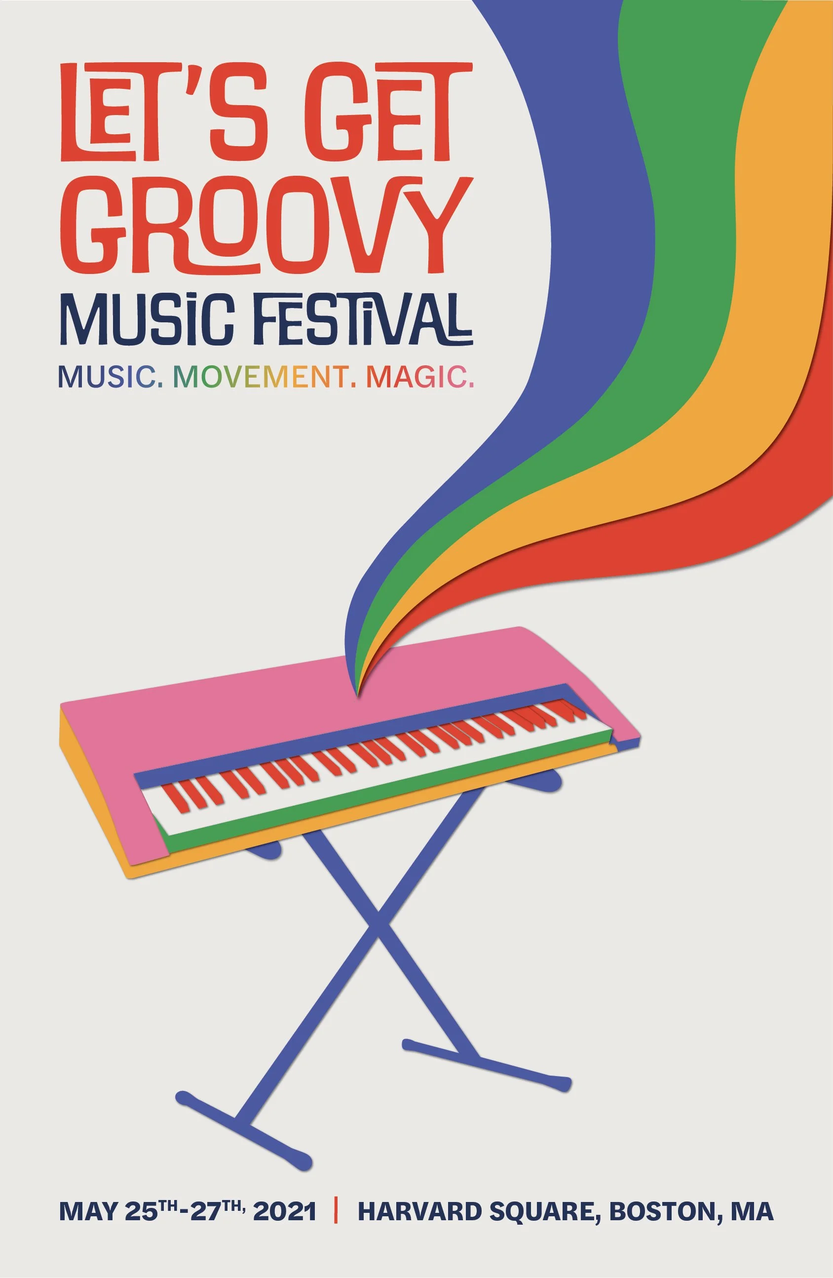
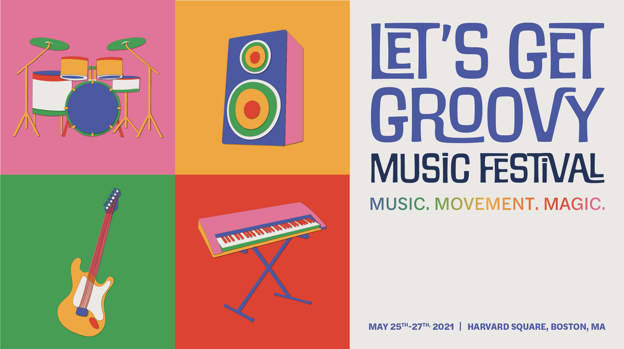
The central imagery in this campaign features four musically themed illustrations—a bold bass speaker, a dynamic drum set, a guitar, and a piano. Designed in a layered paper cutout style, each piece is striking and eye-catching, connecting with rainbow swirls to symbolize sound and movement.
The unstructured, whimsical quality was intentional to resonate with a younger audience and capture the spontaneity of live music. By giving each instrument its own personality, the illustrations work individually or as a set, reinforcing the sense of movement, joy, and creativity at the heart of Let’s Get Groovy.
illustrations
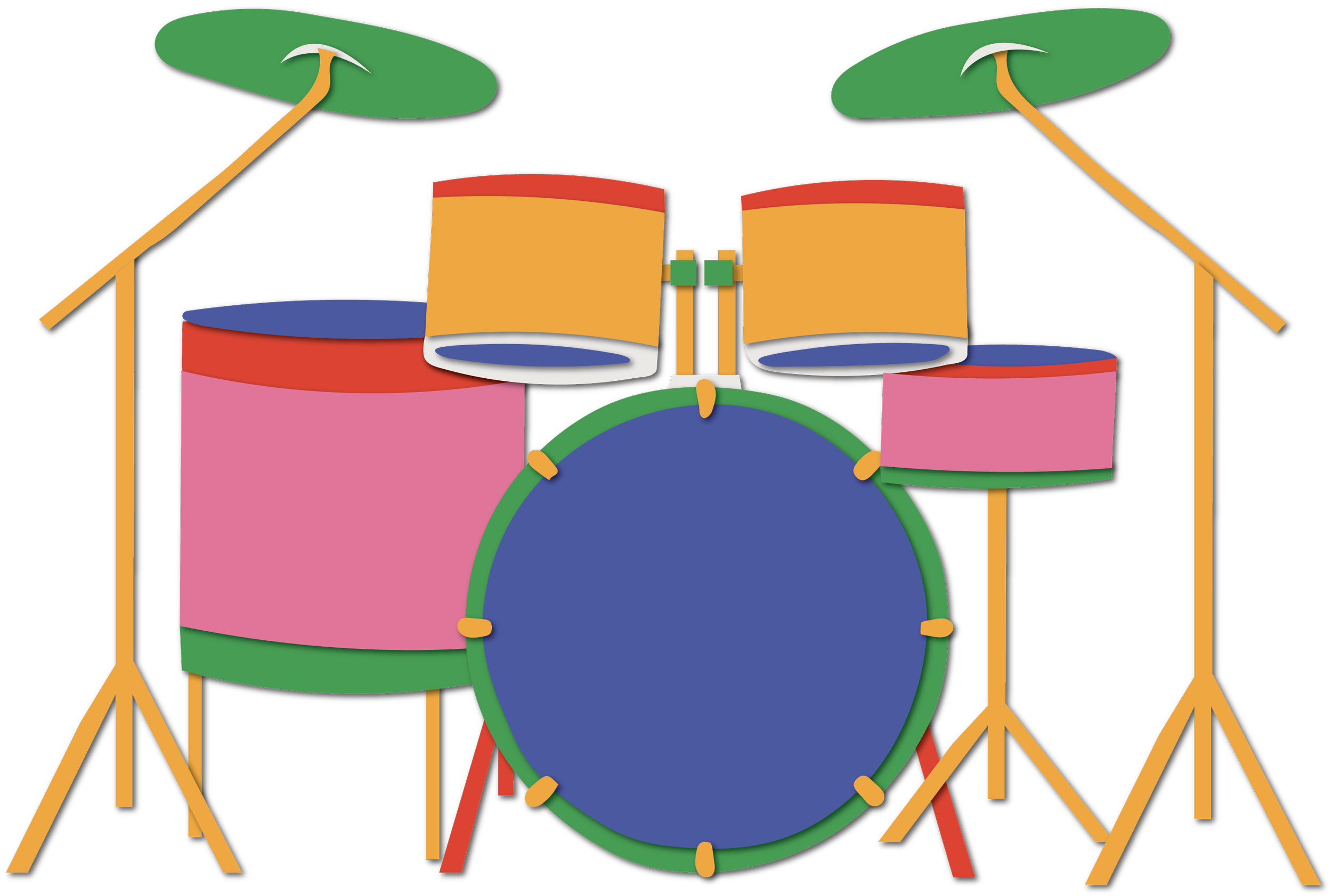

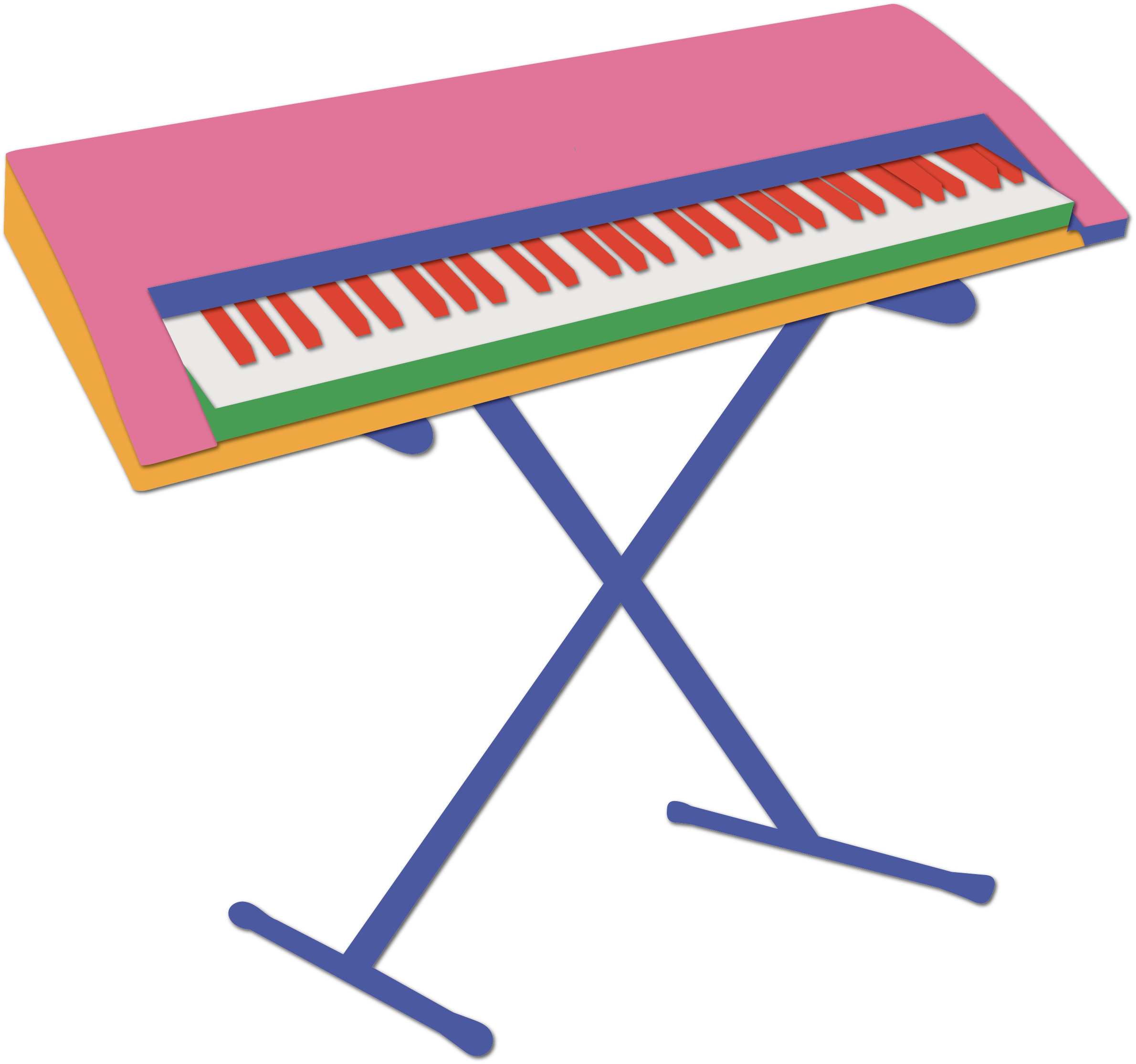
The typeface for “Let’s Get Groovy” is quirky and decorative, embodying a sense of fun and lightheartedness, while the tagline and event details use a sleek serif style for contrast, ensuring clarity and easy readability. The illustrations are designed in a paper cutout style, which adds texture and depth to the visuals. This approach was chosen to evoke a sense of creativity and handcrafted authenticity, appealing to the audience’s appreciation for individuality and artistic expression. The playful, layered look of the paper cutout style brings a dynamic, tactile feel to the designs, reinforcing the festival's energetic and vibrant atmosphere.
final design

posters

billboard
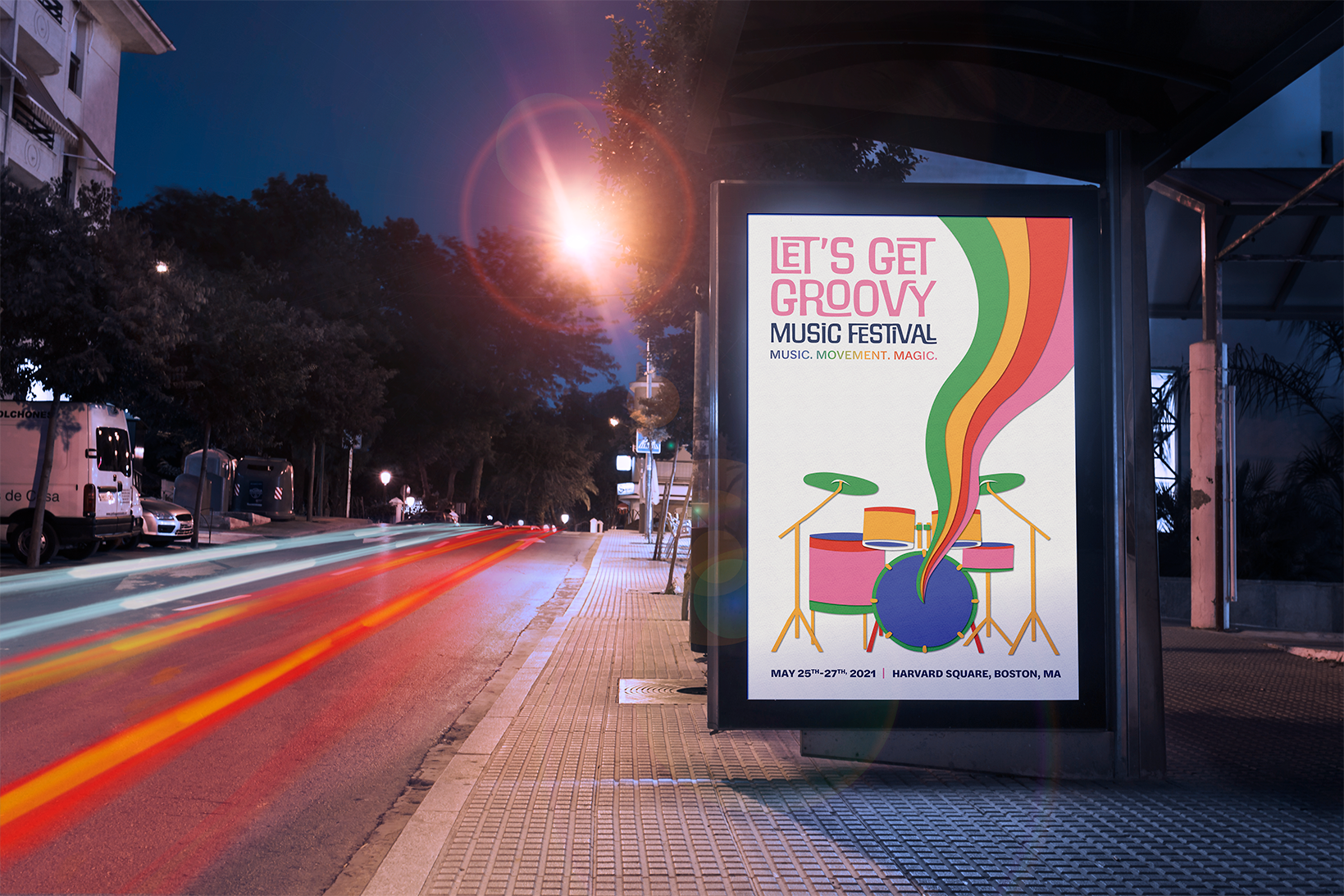
The billboard design highlights the festival’s energy through colorful blocks and large-scale illustrations of the instruments.
The grid-like structure ensures clarity and legibility from a distance, while the vibrant palette immediately grabs attention and conveys a sense of fun and rhythm. This clean but playful approach makes the billboard highly effective in a large outdoor setting, where quick recognition is essential.

social media
The stickers bring the festival’s brand to life in a fun, collectible way. Bold colors and playful variations of the “Let’s Get Groovy” logotype make them eye-catching and energetic, while their variety invites mix-and-match use.

stickers
The stickers bring the festival’s brand to life in a fun, collectible way. Bold colors and playful variations of the “Let’s Get Groovy” logotype make them eye-catching and energetic, while their variety invites mix-and-match use.

tickets
The ticket designs carry the same bold energy as the rest of the campaign, using bright colors and playful typography to make each pass stand out.
The variety of colors not only adds vibrancy but also helps differentiate ticket types, making them both practical and visually engaging. Their simple, graphic style ensures legibility while doubling as a keepsake that reflects the festival’s fun, energetic atmosphere.
