

calvert stewardship report
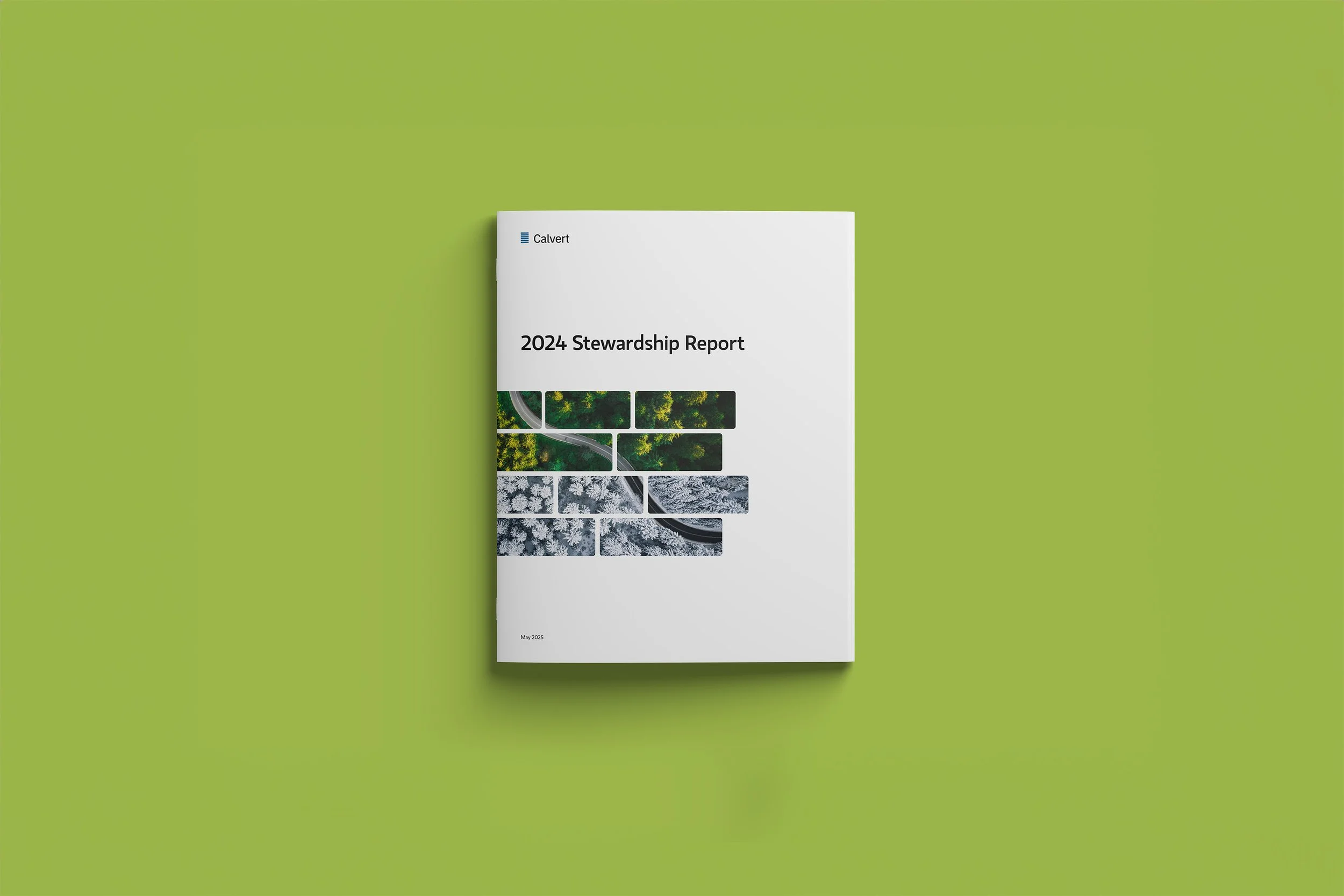
The objective was to design Calvert’s annual Stewardship Report, a 20+ page publication highlighting ESG engagement, proxy voting activity, and shareholder advocacy. The report’s primary audience includes institutional investors, stakeholders, and sustainability-focused partners who rely on Calvert for transparent, measurable impact reporting.
overview
role
Designer
design focus
Publication design, composition, data visualization, infographics, photography, layout design
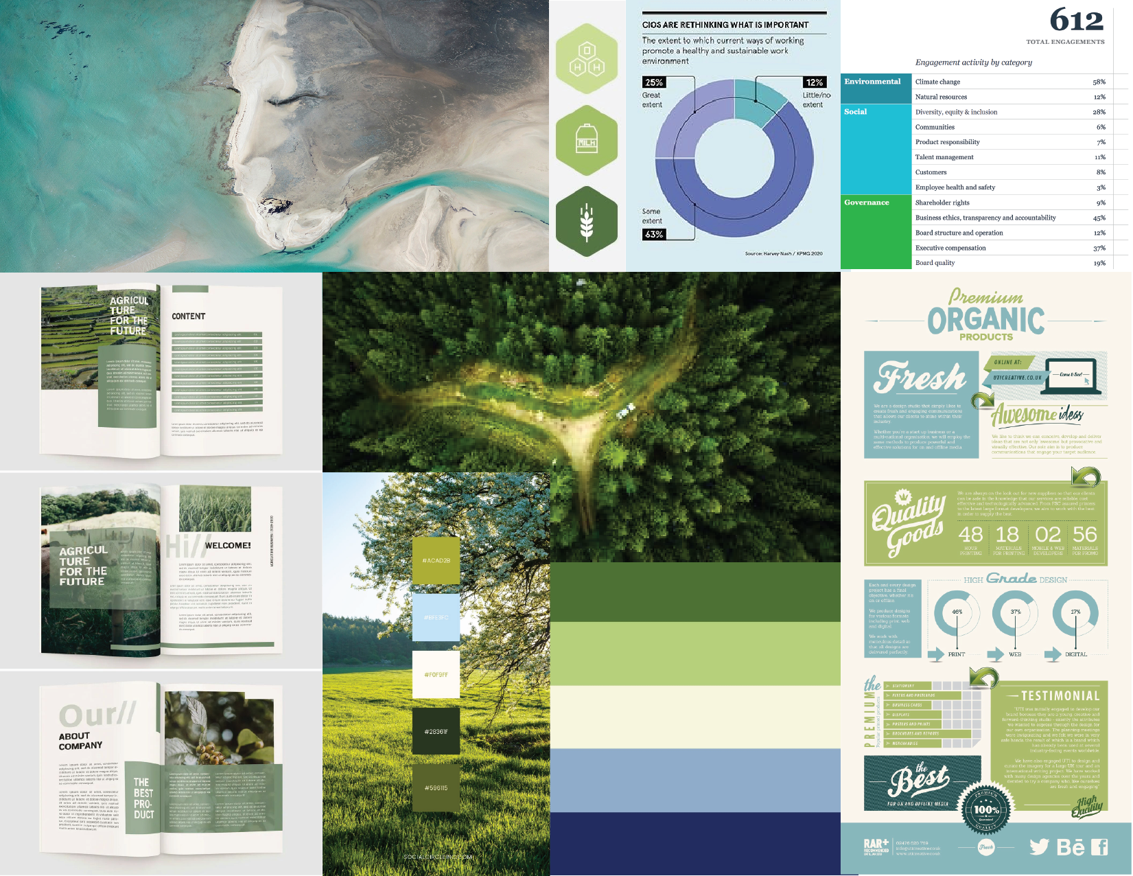
This moodboard reflects Calvert’s focus on environmental stewardship, sustainable investing, and corporate accountability.
The photography captures wide landscapes and human connection, tying directly to the report’s themes of transparency and impact.
inspiration
approach
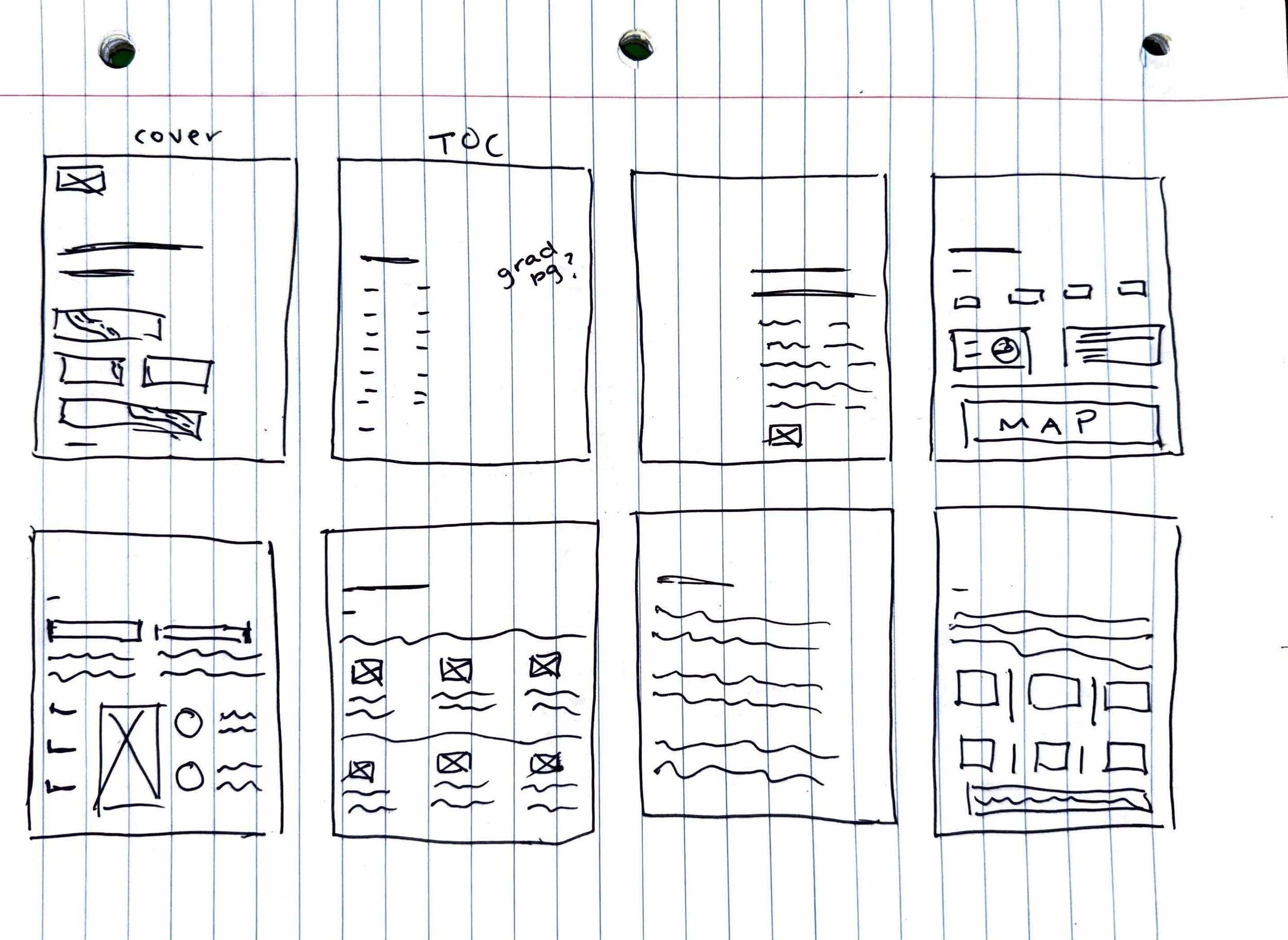
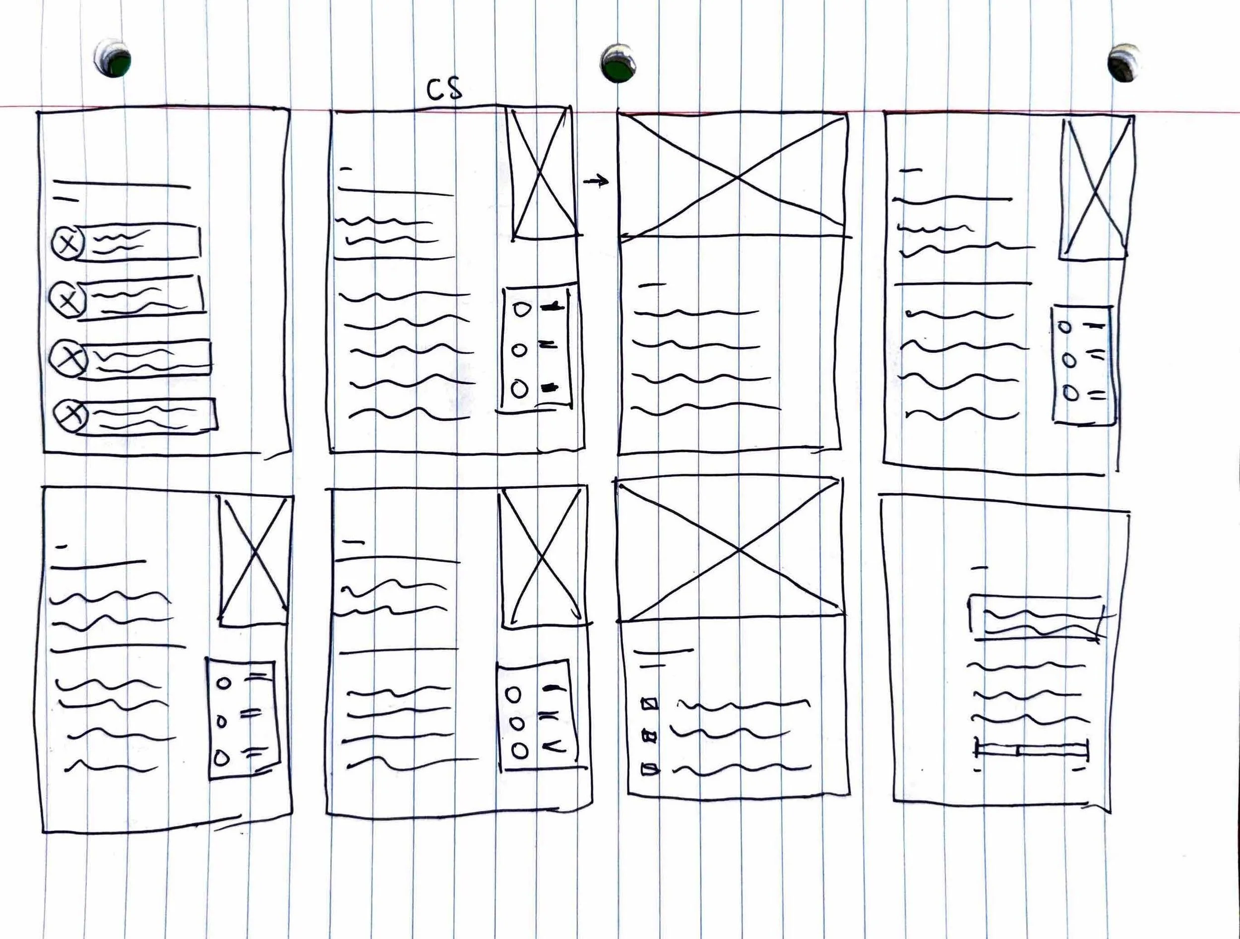
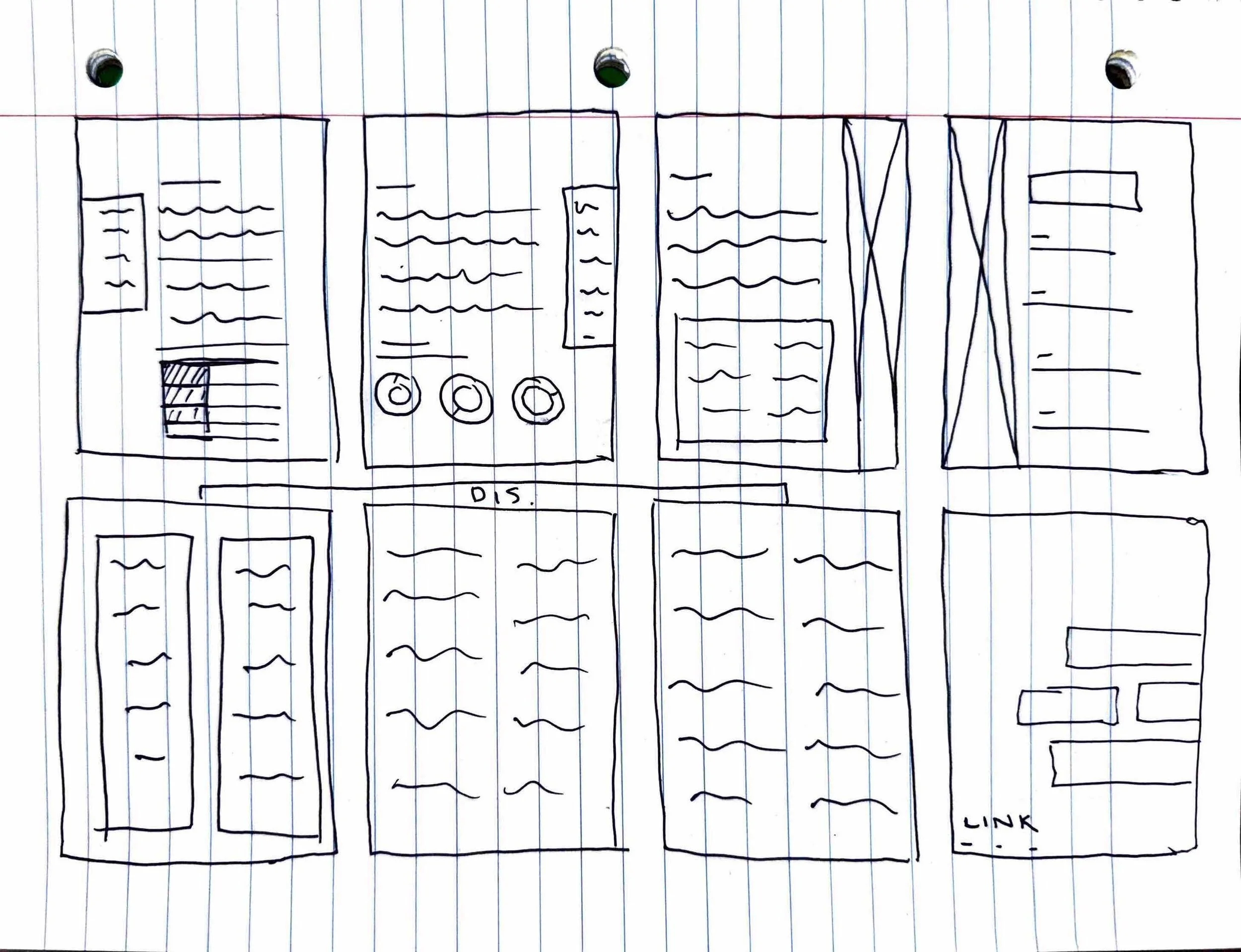
I sketched a series of wireframes to establish a consistent structure for the report. These rough page plans helped me think through how to unify the piece visually while keeping each section distinct and on brand.
I also planned for small “visual moments” throughout the report, like full-bleed imagery or callout stats, to break up text-heavy pages and add energy without overwhelming the overall flow.
sketches
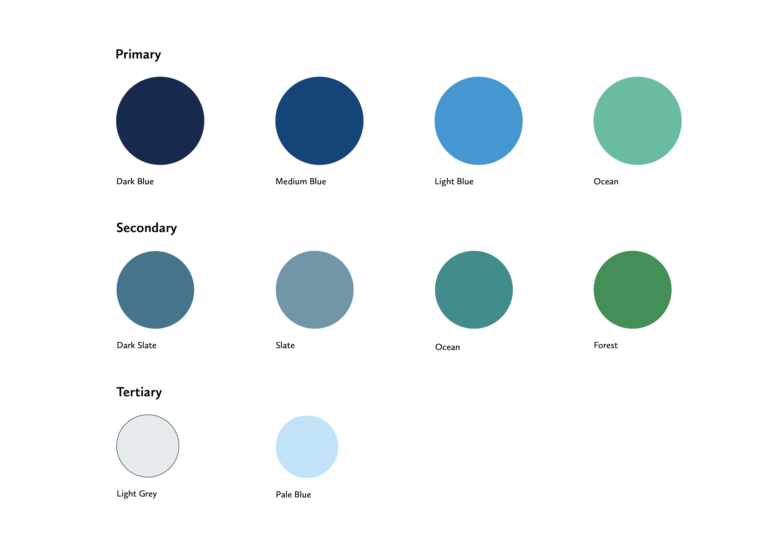
The report’s color palette was anchored in shades of blue, chosen to reflect Calvert’s authority and stability.
Secondary greens added a layer of meaning tied to stewardship, renewal, and Calvert’s ESG mission, while teals and aquas introduced freshness and balance across the layouts.
Lighter neutrals were used to create breathing room and highlight key moments, ensuring the palette could support both dense data and bold environmental photography.
color selection
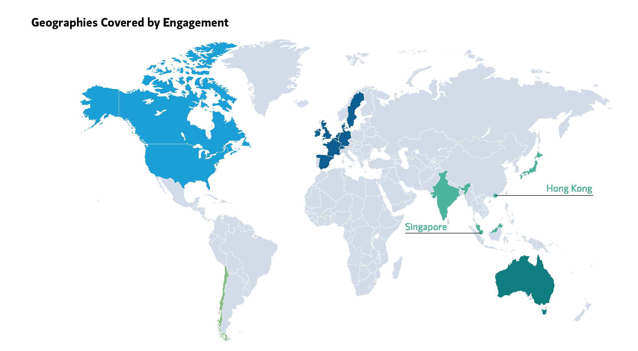
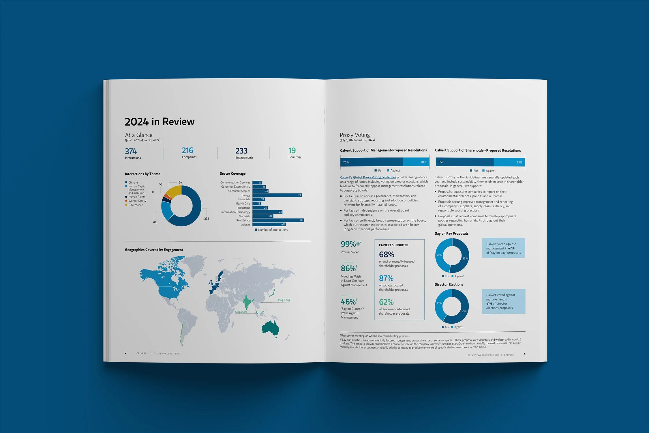
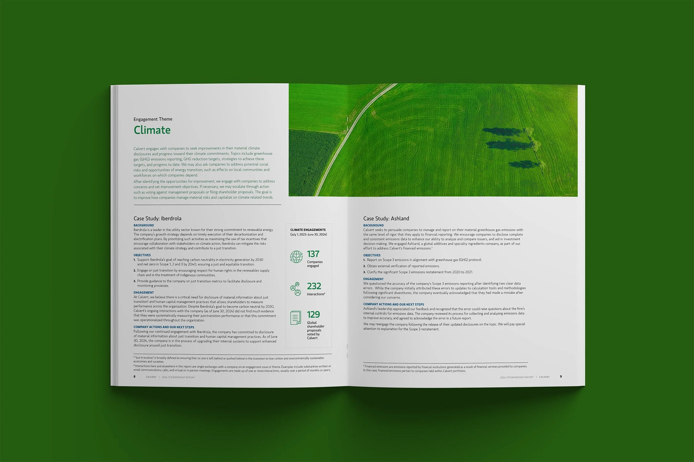
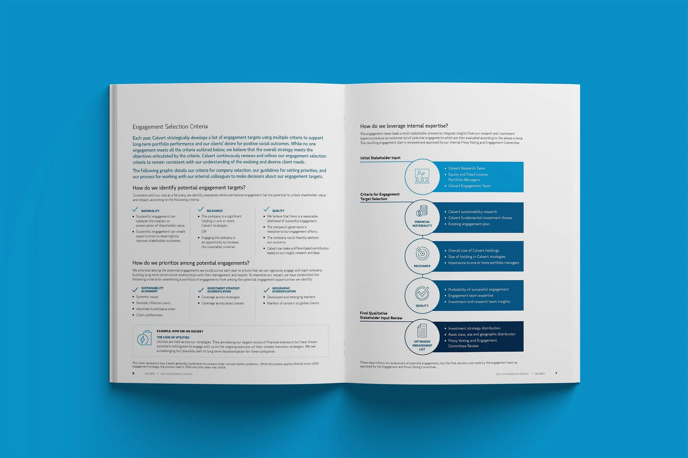
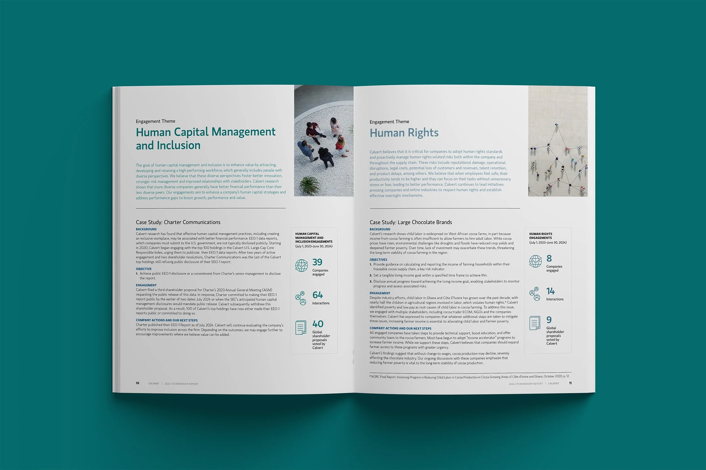
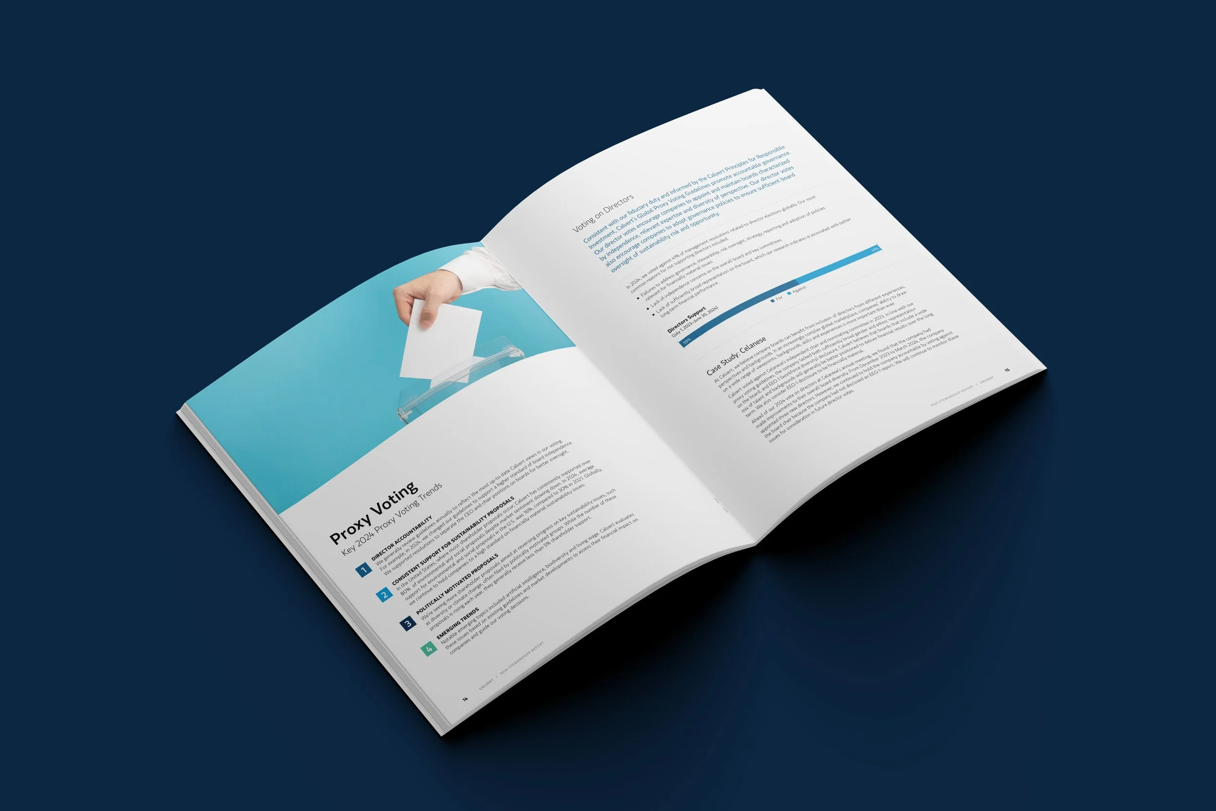
I designed the infographics in this report to make complex ESG data clear and accessible. Using icons from Calvert’s brand library, I built custom charts, maps, and diagrams to highlight engagement, proxy voting, and advocacy work.
infographics and icons
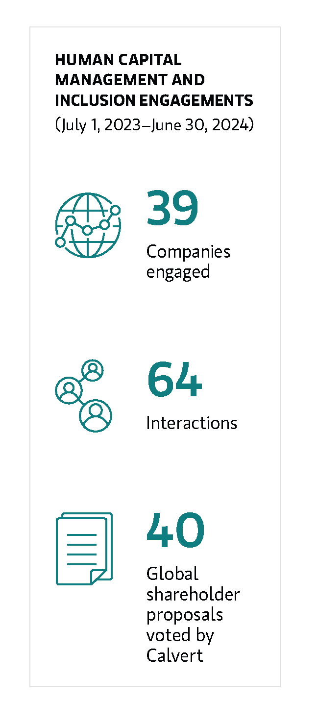
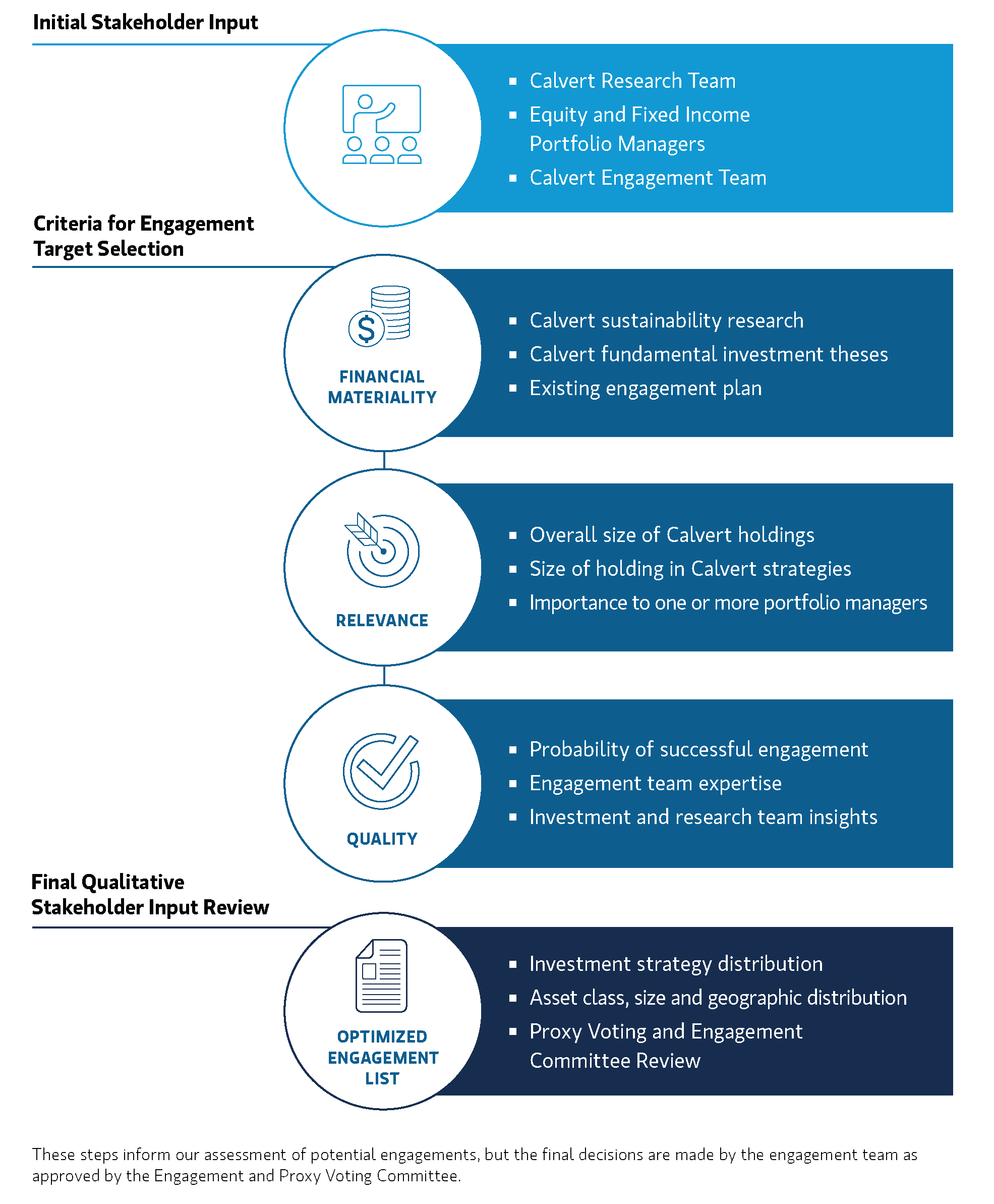
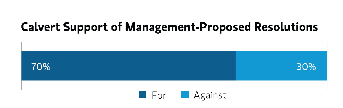
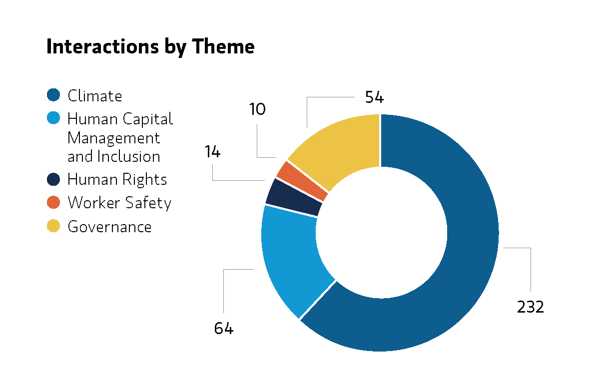


The visual strategy for this report centered on clarity, trust, and environmental stewardship. I built a clean, accessible grid system to support dense financial and ESG data, using hierarchy and white space to guide the reader through complex content without overwhelming them. Custom charts and infographics distill proxy voting trends and shareholder engagement metrics into visually digestible formats, balancing precision with readability.
final design

Design and layout by Catherine Kessler. © 2024 Calvert Research and Management. All rights reserved.